
Design PrinciplesConsistent spacing can make a page easier to scan without making every gap identical. Learn how to choose a small set of distances, use them to show relationships, and adjust them when the layout changes.
Read article · 3 min↗

Design PrinciplesA good crop can make an image clearer and more engaging, but a tighter frame can also remove the detail that gives it meaning. Learn how to identify essential visual information, choose an aspect ratio, and check the edges before you commit.
Read article · 4 min↗
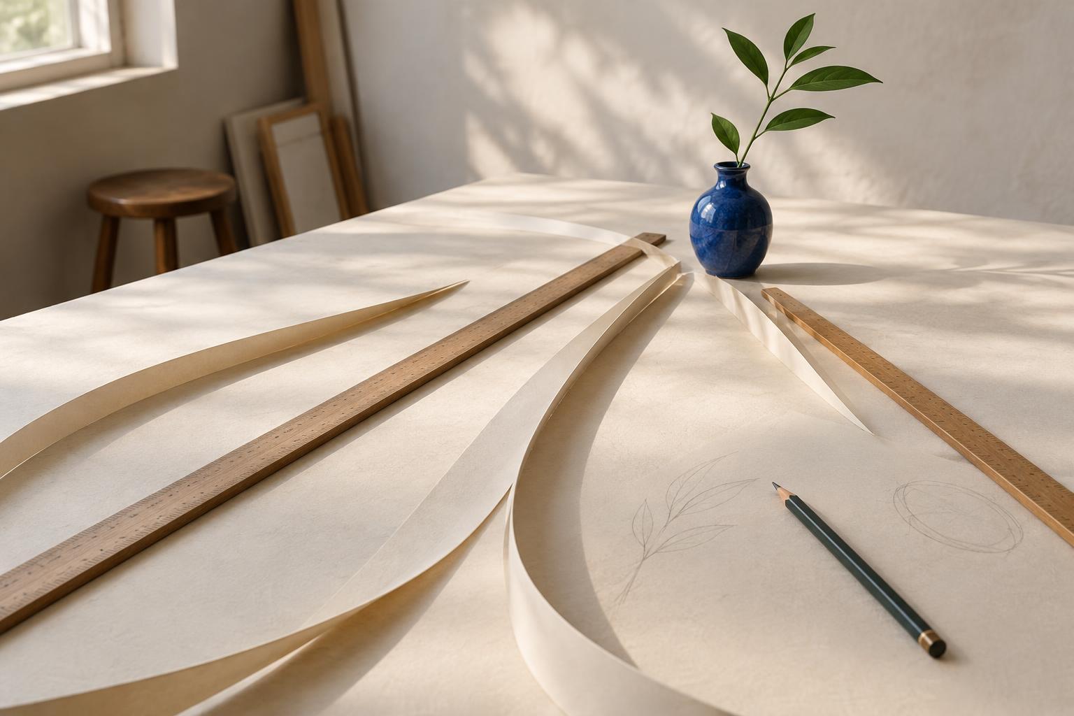
Design PrinciplesLeading lines can help viewers find a path through a drawing, photograph, or design. Learn how to choose a focal point, work with straight and curved lines, and keep the composition open to exploration.
Read article · 4 min↗

Design PrinciplesA broken circle can still look like a circle. Learn how the Gestalt principle of closure helps viewers perceive incomplete shapes, and how to use it in artwork, layouts and everyday design.
Read article · 4 min↗
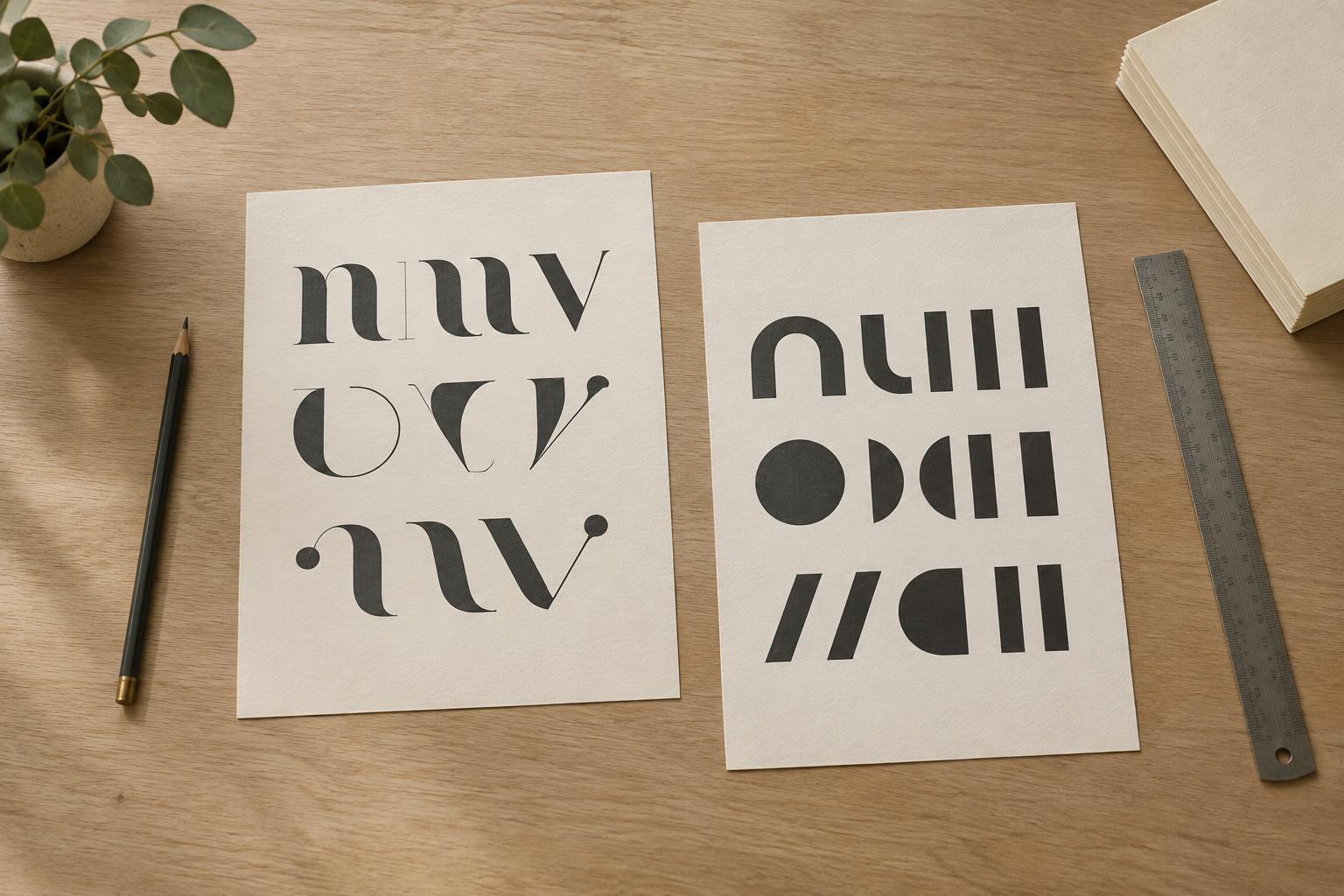
Design PrinciplesA calm type pairing gives each typeface a clear job. Learn how to choose complementary styles, build hierarchy, and use spacing and repetition to keep a page easy to read.
Read article · 4 min↗
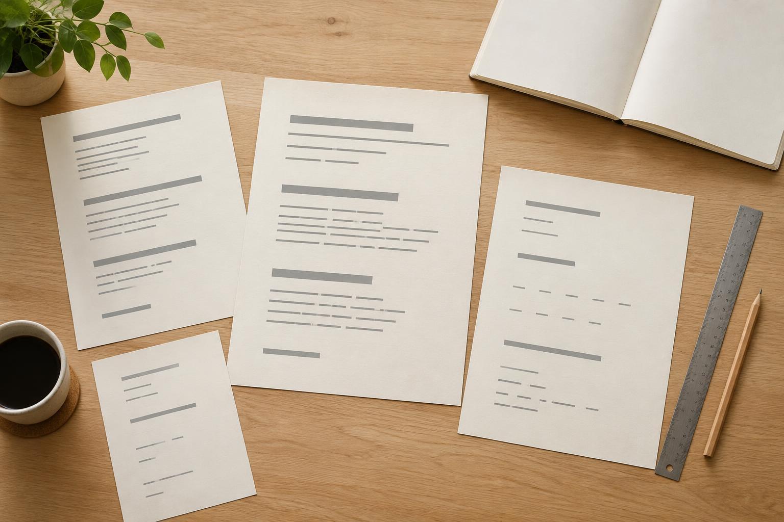
Design PrinciplesReadable typography is not just about picking a familiar font. Learn how type size, line spacing, letter spacing, and line length work together to make text easier to follow in print and on screen.
Read article · 4 min↗
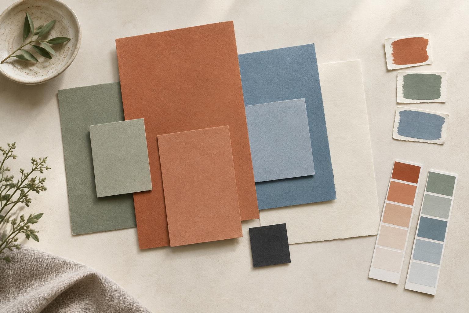
Design PrinciplesA limited palette can make a design feel connected without making it monotonous. Learn how to choose a starting color, assign roles to a few supporting colors, test contrast and adjust the palette in context.
Read article · 4 min↗
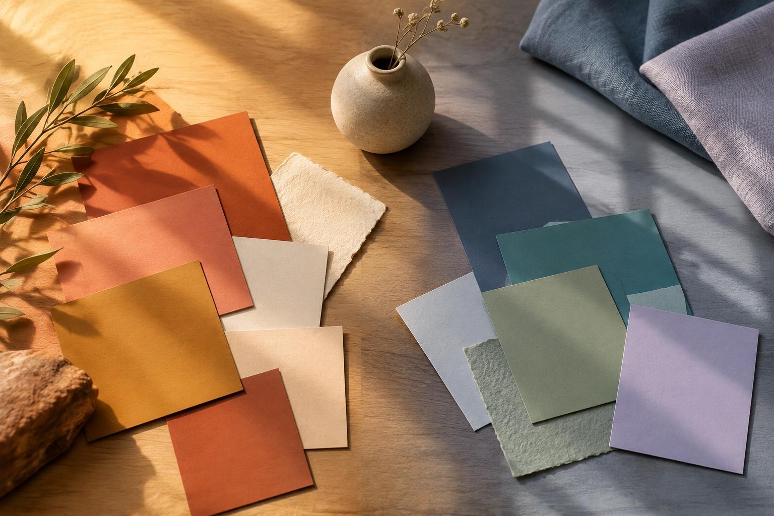
Design PrinciplesWarm and cool colors can make a design feel lively, calm, intimate or spacious. Learn how temperature works with contrast, lighting and context, and how to build a palette that suits your purpose.
Read article · 4 min↗
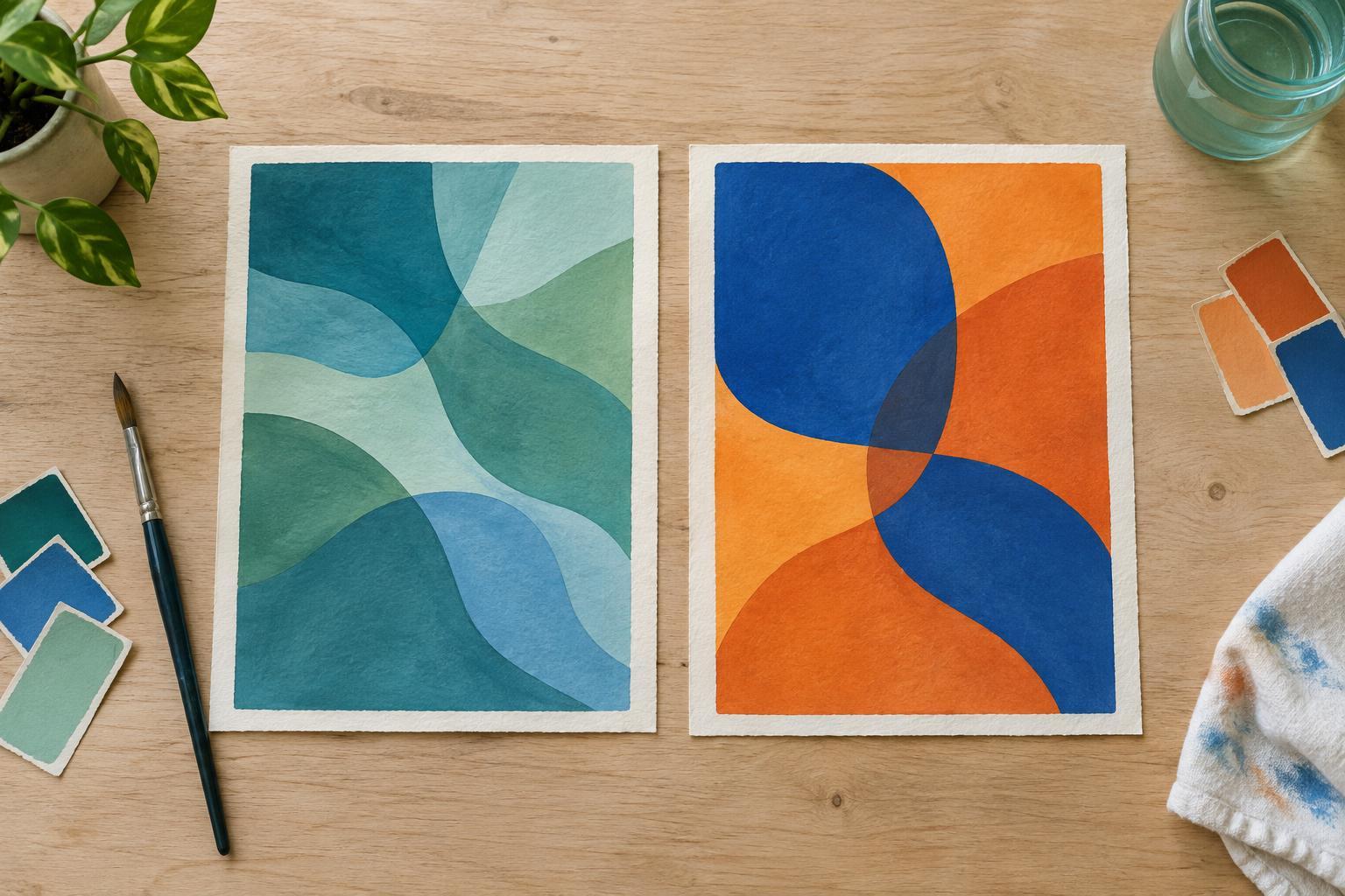
Design PrinciplesAnalogous colors sit near one another on a color wheel, while complementary colors sit across from each other. Learn how each scheme shapes mood, contrast and visual focus, and how to use both in art, design and everyday spaces.
Read article · 4 min↗
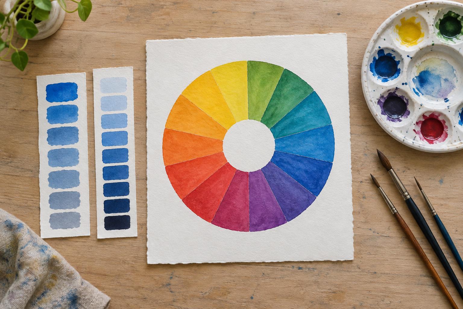
Design PrinciplesColor becomes easier to use when you can describe what you see. Learn how hue, saturation, and value work on a color wheel, and try a simple exercise to put them to use in art and design.
Read article · 4 min↗
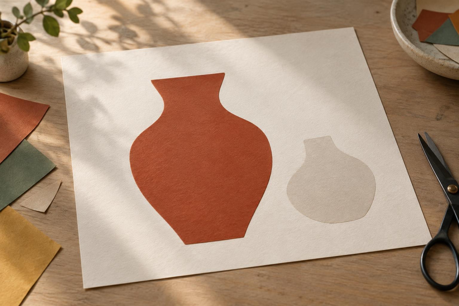
Design PrinciplesA subject can be beautifully drawn and still get lost against its background. Learn how contrast, edges, spacing, and visual detail help viewers tell figure from ground—and how to test a composition before calling it finished.
Read article · 4 min↗
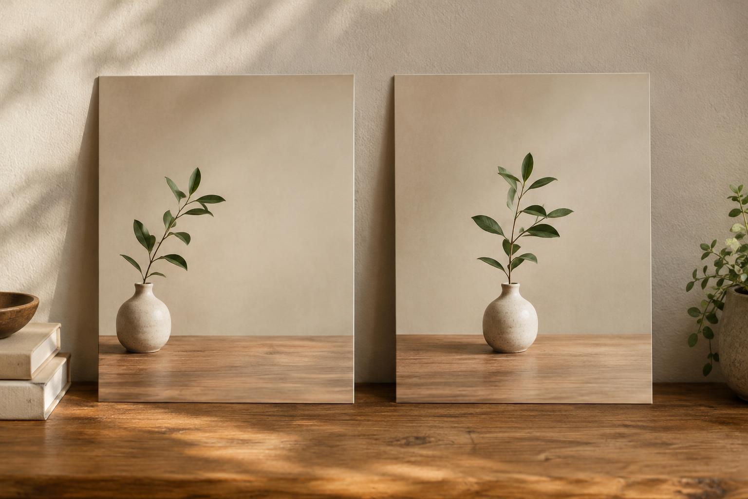
Design PrinciplesThe rule of thirds and centered composition offer different ways to guide a viewer’s attention. Learn what each approach does, when it helps, and how to test both in your own images and layouts.
Read article · 4 min↗
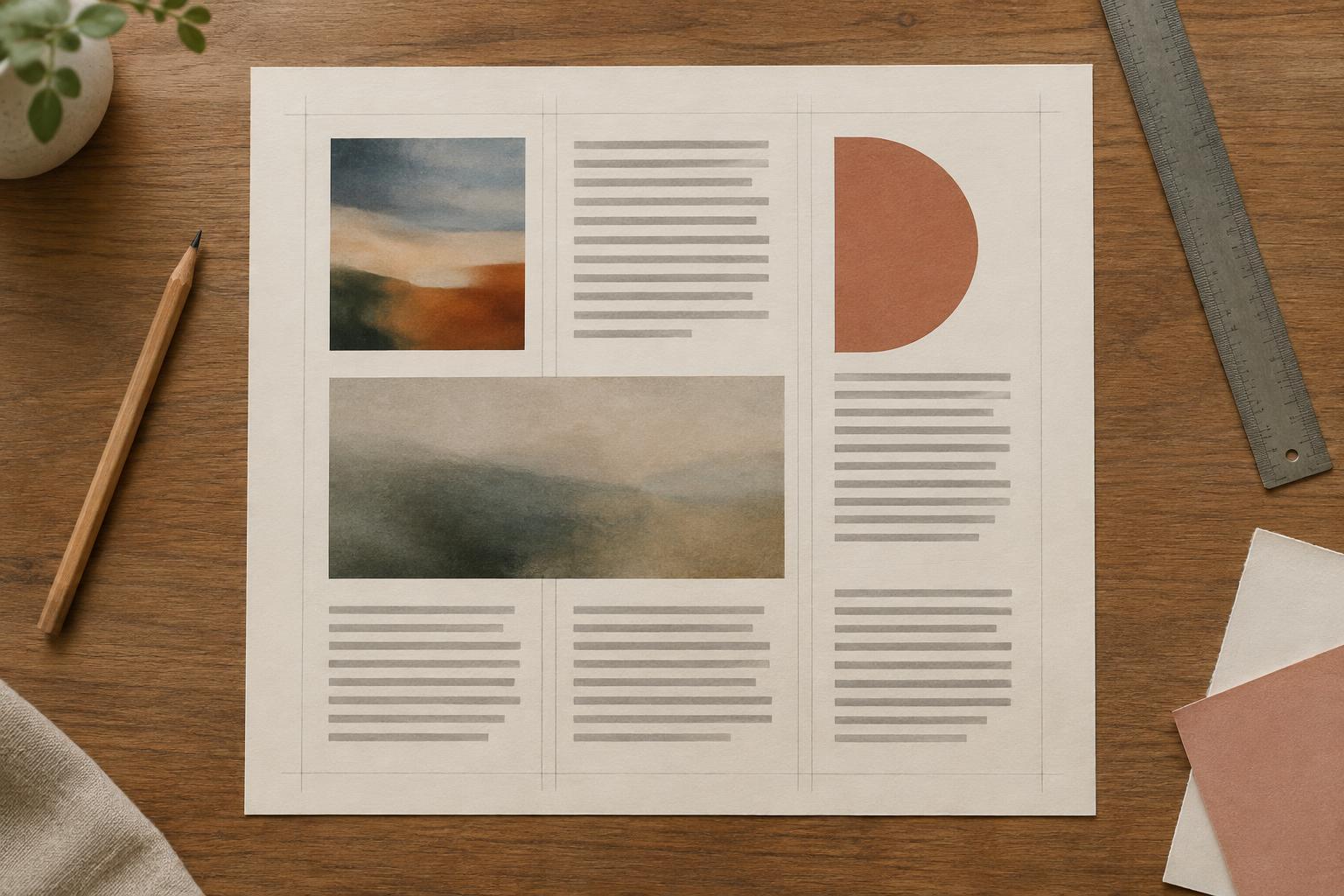
Design PrinciplesA grid gives text and images a shared structure without making every page look the same. Learn how to set margins, divide the space into columns, align content and adjust the layout when it feels too rigid.
Read article · 4 min↗
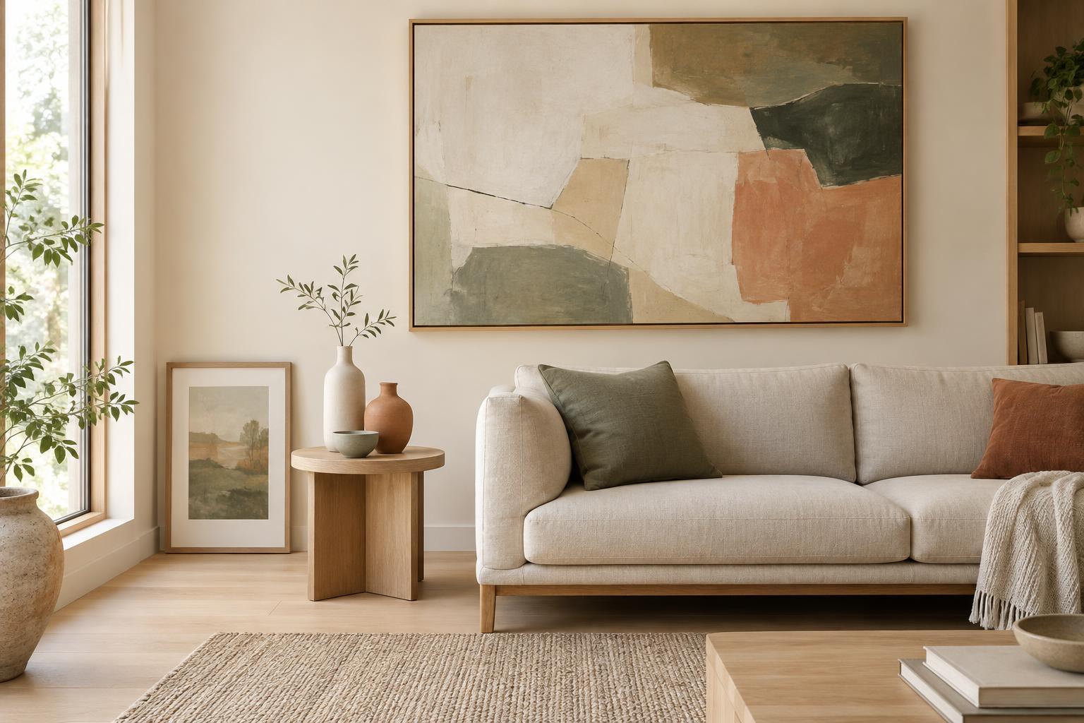
Design PrinciplesScale and proportion both describe size relationships, but they answer different questions. Learn how to use each idea when arranging artwork, planning a composition, or choosing objects for a room.
Read article · 4 min↗
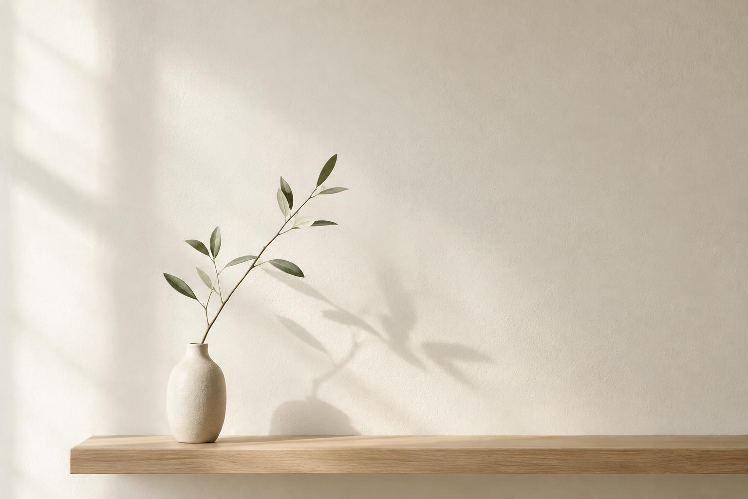
Design PrinciplesNegative space is the area around and between the elements of a composition. Learn how it shapes attention, improves clarity, and helps artwork and everyday displays feel more intentional.
Read article · 4 min↗
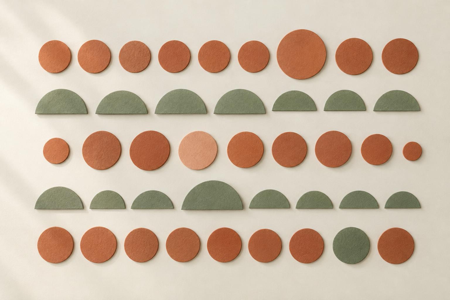
Design PrinciplesRepeated shapes, colors and spacing can help a design feel connected without making it monotonous. Learn how to build visual rhythm, introduce variation and check whether the result feels balanced.
Read article · 4 min↗
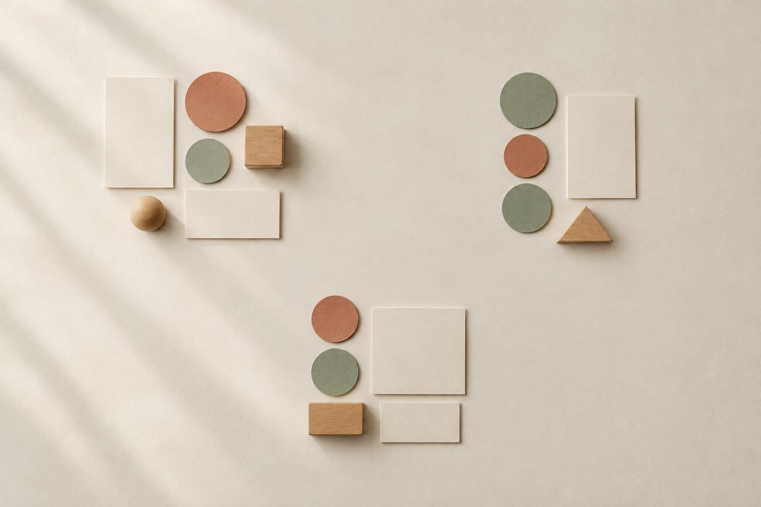
Design PrinciplesProximity is a simple design principle: elements placed near one another tend to be read as a group. Learn how to use spacing to clarify relationships in layouts, displays and everyday creative projects.
Read article · 4 min↗
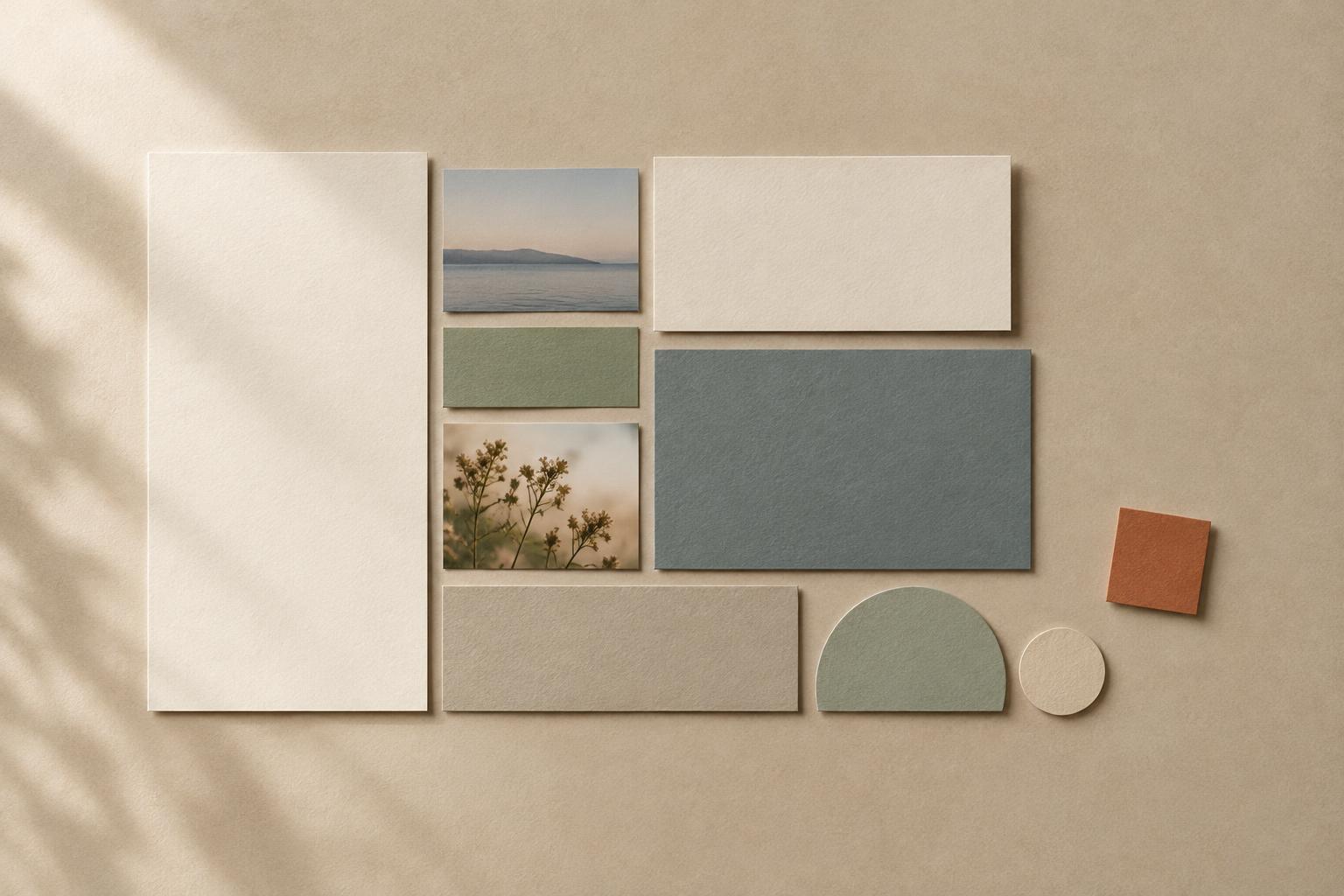
Design PrinciplesAlignment gives separate elements a visible relationship. Learn how shared edges, centers and baselines make posters, pages and everyday arrangements easier to understand—and when a deliberate break can add emphasis.
Read article · 4 min↗
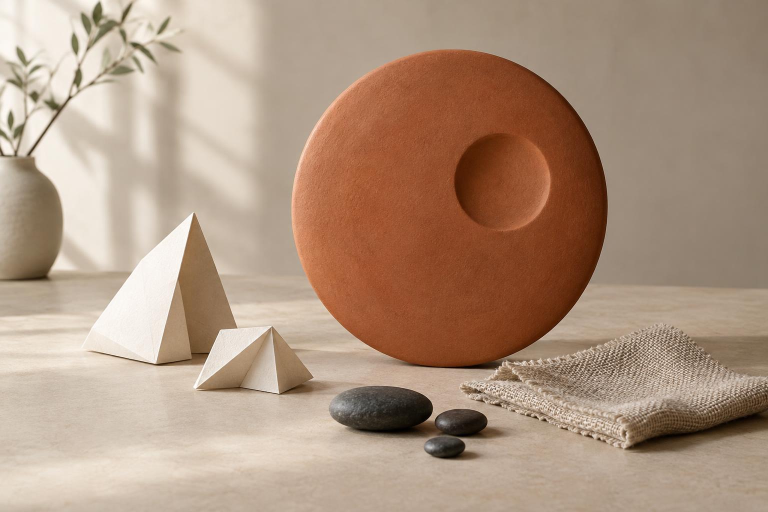
Design PrinciplesContrast helps viewers tell elements apart and understand what deserves attention first. Learn how differences in size, shape, and texture can create a clearer visual hierarchy in artwork, layouts, and everyday displays.
Read article · 4 min↗
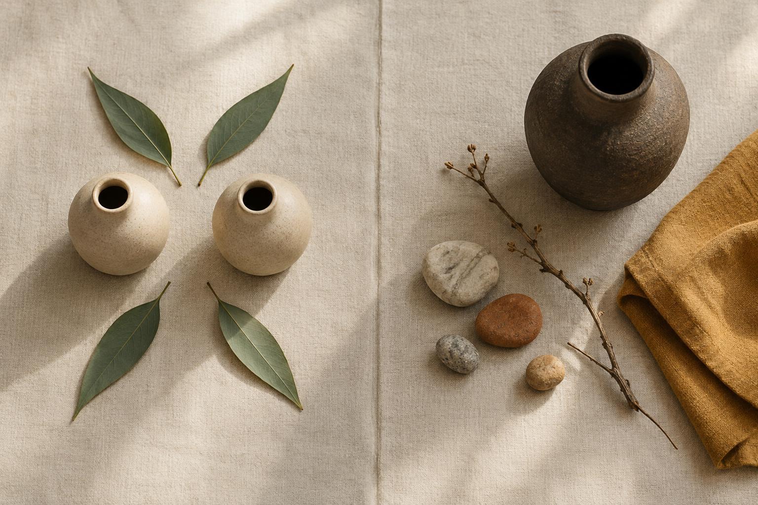
Design PrinciplesBalance helps an image, layout or arrangement feel intentional. Learn how symmetrical and asymmetrical compositions work, what gives an element visual weight, and how to choose between the two.
Read article · 4 min↗
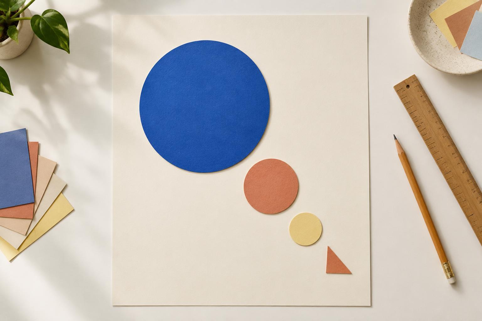
Design PrinciplesVisual hierarchy helps guide the eye through a page, poster, image or room. Learn how to choose a focal point and use size, contrast, placement and spacing to make a design easier to understand.
Read article · 4 min↗