What repetition and rhythm do
Repetition occurs when a visual element appears more than once. It might be a color used across a page, a rounded edge shared by several objects, or a shape that returns throughout a pattern. Each recurrence gives the viewer something familiar to recognize. That familiarity can make separate parts of a design feel as though they belong together.
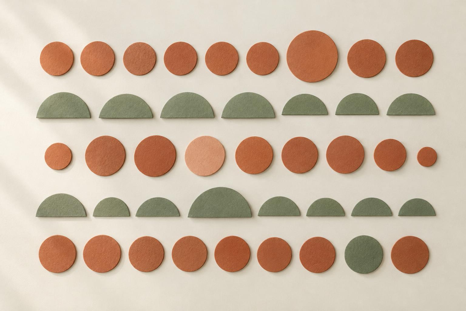
Rhythm is the sense of movement created by those recurring elements and the spaces between them. A row of evenly spaced marks has a steady rhythm; a sequence of small, small and large shapes feels more varied. Rhythm guides attention from one area to another. Repetition supplies the recognizable elements, while rhythm describes how they unfold across the design. Neither requires perfect uniformity: a design can be cohesive even when some elements change.
Choose a few elements to repeat
Begin by identifying what should connect the design. In a poster, that might be one accent color, a consistent type style and a recurring line. In a room, it could be a curved silhouette echoed in a lamp, a mirror and a chair. Repeating a small number of features gives the eye useful connections without making every detail match.
Choose elements that support the purpose of the design. A repeated border can organize information; repeated colors can link objects placed far apart; repeated shapes can give a collection a shared character. Materials and textures count, too. A matte finish appearing in several places may create a quieter connection than a bold pattern. Try to notice where each element appears: if all the repetition is concentrated in one corner, the rest of the composition may still feel disconnected.
Use spacing to set the pace
The distance between repeated elements affects how a design feels. Equal gaps create an orderly pace, useful for a grid of images or a series of labels. Wider gaps can make individual elements feel more important, while close spacing can make them read as a group. Empty space is therefore part of the rhythm, not merely the area left over after placing objects.
You can also build a sequence by changing the intervals deliberately. Imagine three artworks along a wall: two placed closer together may read as a pair, with the third given more room to stand apart. In a layout, a little extra space before a new section can signal a shift without changing the entire visual system. When adjusting spacing, check whether the groupings you create match the relationships you want viewers to notice.
Add variation without losing cohesion
If every element has the same size, color and position, repetition can become predictable. Variation gives the eye a reason to keep moving. Try repeating one feature while changing another: use the same shape at different scales, or keep a consistent color while alternating between solid and outlined forms. A clear shared feature lets the differences feel intentional.
Decide which moments deserve emphasis. A larger image among smaller ones, or a single warm accent within a restrained palette, can act as a focal point. The surrounding repetition helps that difference stand out. If every element is treated as an exception, however, the viewer may struggle to find a pattern. A useful starting point is to establish the rhythm first, then change it in one or two places for a reason.
Test the design as a whole
Step back from the work or view it at a smaller size. What catches your attention first, and where does your eye go next? Look for connections between distant parts of the design. If one area feels unrelated, you might repeat a color or shape there rather than adding an entirely new motif. If the result feels too uniform, vary the scale, spacing or density in a limited area.
It helps to change one thing at a time. Move a repeated element, adjust the gap around it, then look again. This makes it easier to tell which choice improved the composition. Whether you are arranging a page, planning a pattern or placing objects on a shelf, repetition and rhythm work best when they serve what you want people to see: a design that feels connected, yet still offers moments of interest.


