What a grid does
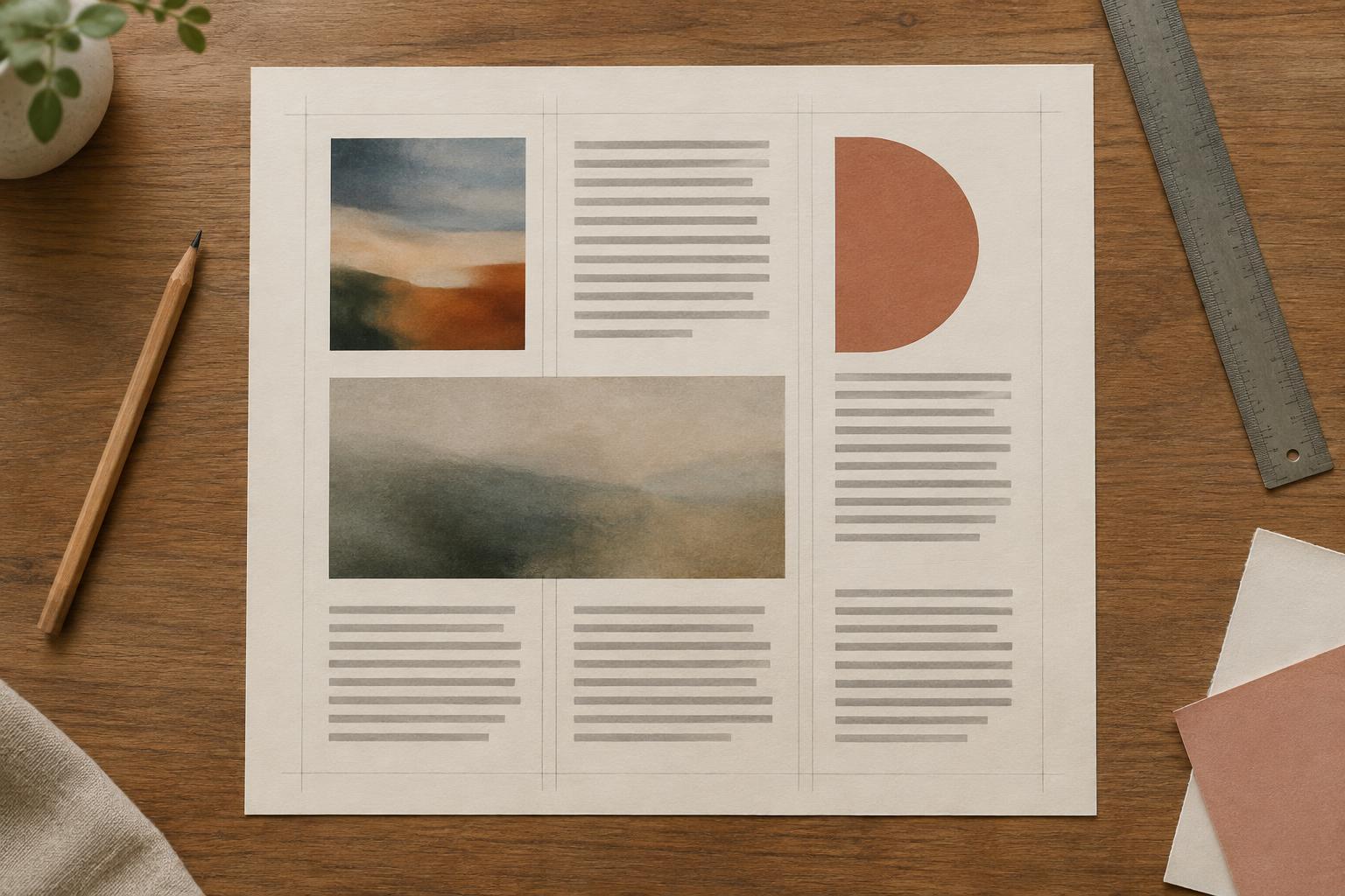
A page grid is a set of guides that helps you decide where content goes. It can be as simple as an outer margin and two columns. The guides do not appear in the finished work; they give the visible elements a relationship to one another. A heading might begin at the same left edge as a photograph, while a caption lines up with the text beside it.
A grid is useful when a page contains several things that need attention: a title, body text, images, captions or a small piece of supporting information. Rather than placing each item by eye in isolation, you make a few decisions about the whole page first. This can make the layout easier to scan and easier to revise. It does not mean every space must be filled or every element must be the same size.
Start with the edges and the spaces between
Begin by marking a margin around the page. The margin is the clear space between your content and the edge. You do not need a precise formula: choose a width that gives the content room to breathe, then keep it consistent unless you have a reason to change it. On a small page, a generous-looking margin may leave too little space for readable text, so judge it alongside the material you plan to include.
Next, divide the area inside the margins into two equal columns. Leave a gap between them; this gap is often called a gutter. Make it wide enough that text in one column does not seem to run into the other. If you are working on paper, lightly draw these guides in pencil. In design software, use guides or a temporary layer that you can hide before finishing.
You now have a simple framework: outer edges, two columns and a space between them. Before arranging anything, write down what the page needs to communicate. Which item should someone notice first? What should they read next? The grid will help position those items, but their order of importance should guide your choices.
Place content by alignment, not by filling boxes
Try a one-page handout about a drawing workshop. You might let the main heading span both columns at the top. Below it, place a short introduction in the left column and an image in the right. Put practical details beneath the introduction, with their left edges aligned. If the image needs a caption, align the caption with the image rather than centering it somewhere unrelated.
Notice that the columns are guides, not containers you must fill from top to bottom. A short block of text can leave open space beneath it. A strong image can span both columns if it needs more room. What matters is that these choices look deliberate: edges line up, related items sit near each other, and the most important information has enough space to stand out.
Keep an eye on the spaces between elements as well as their edges. For example, use a smaller gap between an image and its caption than between that image and the next section of text. This helps readers see which parts belong together, even before they read a word.
Use the grid to create rhythm and emphasis
Once the basic layout works, vary the scale of elements within it. A large heading across two columns can lead into smaller text set in one column. An image that occupies most of a column can balance a compact group of details on the other side. Repeating a few alignments and spacing choices gives the page a sense of rhythm without requiring perfect symmetry.
You can also break the grid on purpose. A small label placed just outside a column, for instance, may draw attention to a new section. First establish enough consistency that the departure is noticeable. If every item follows a different edge, the reader may not see any one exception as meaningful.
Check the reading path before you finish. Step back from a printed page or view a digital layout at a smaller size. Can you spot the heading, find the main content and understand which caption belongs to which image? If not, try changing size, position or spacing before adding decorative details.
Adjust the grid to fit the page
A two-column grid is a starting point, not a rule for every format. On a narrow screen, two columns may make text uncomfortably short or squeeze an image. Let the content stack into one column while preserving useful relationships: shared edges, clear gaps and a sensible reading order. On a wider page, you might use more columns, but add them because they solve a layout problem, not simply because there is room.
Finally, test the page with its real text and images. Placeholder content can hide awkward line breaks or a caption that is longer than expected. Move guides if necessary, but resist making tiny exceptions for every element. A good grid gives you enough structure to make decisions confidently and enough flexibility to let the content lead.


