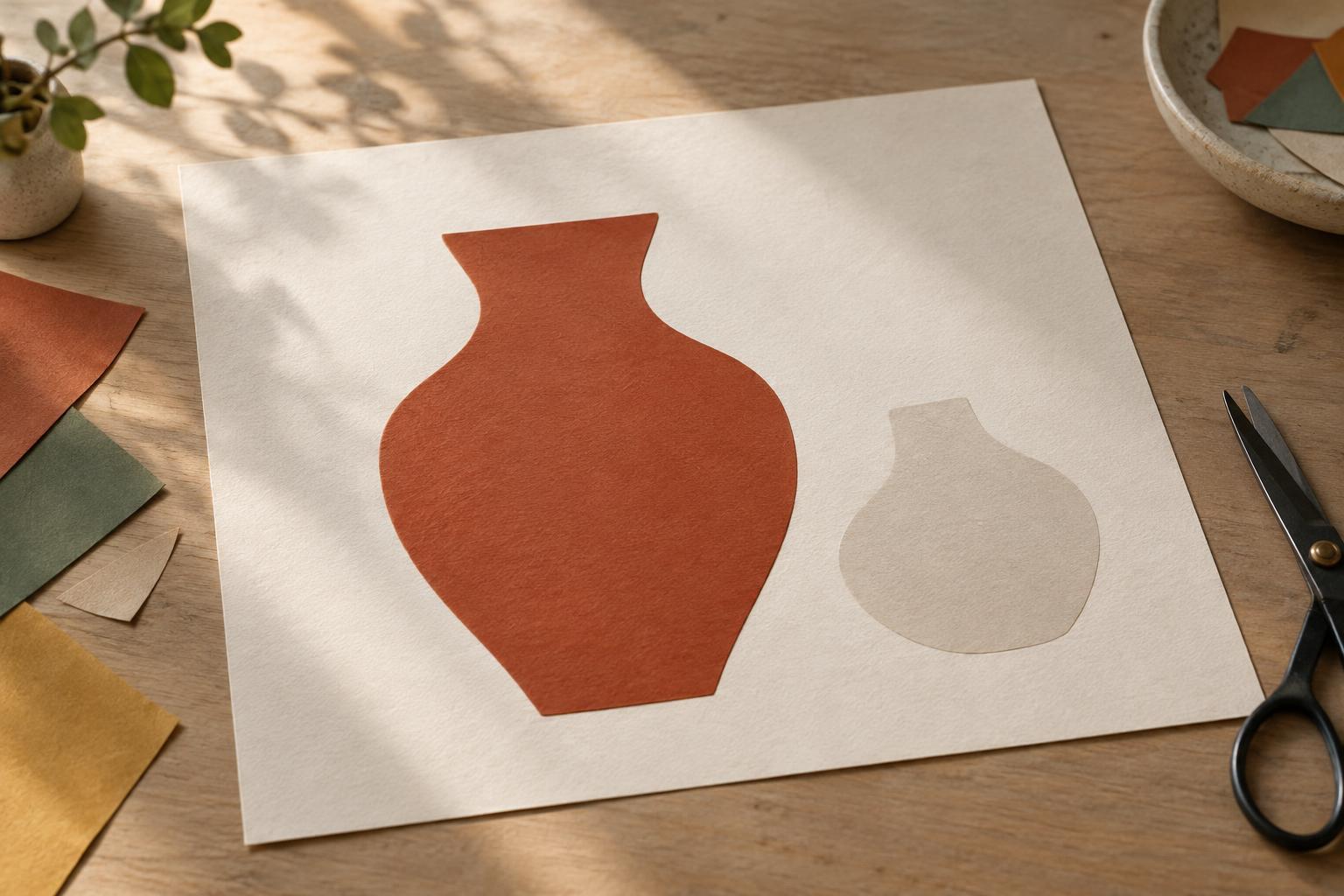
What figure and ground mean
The figure is the shape or area we notice as the subject. The ground is the surrounding area against which we see it. In a portrait, a face might be the figure and the wall behind it the ground. In a poster, the headline might be the figure while color, texture, and other shapes form its ground. The distinction is not fixed: a background can become the focus when we choose to look at it differently.
Clear figure-ground relationships help viewers understand where to look first. If a subject and its surroundings have similar shapes, colors, or levels of detail, the eye may move between them instead of settling. That ambiguity can be an interesting artistic choice. But when you want a person, object, word, or action to read quickly, it helps to give that element a distinct visual role.
Start with contrast, not decoration
Value—the relative lightness or darkness of an area—is often the simplest place to start. A dark object against a light background is usually easier to identify than the same object against a similarly dark one. Squint at your composition or view it in grayscale. If the subject nearly disappears, consider changing its value, the value immediately behind it, or both. You do not need strong contrast everywhere; concentrating it near the focal point can be more useful.
Color offers another way to separate areas, but a difference in hue alone may not be enough. A red shape and a green shape can still compete if they have similar values and saturation. Try placing a vivid subject against a quieter ground, or reserve a distinctive color for the element you want noticed first. Check that the important distinction remains understandable without relying on color alone, especially when the work includes text or instructions.
Give important shapes room to breathe
Negative space is the open area around and between forms. It can make a figure easier to recognize by keeping its outline from tangling with nearby elements. Imagine a drawing of a cup: if its handle overlaps a busy pattern, the handle may be hard to read. Moving the cup, simplifying the pattern, or leaving a small patch of calmer space around the handle can clarify its shape without changing the cup itself.
Pay attention to places where two outlines almost touch. A branch that appears to grow out of a person’s head, or a caption that sits too close to an image edge, may create an unintended connection. Try shifting one element slightly or adjusting the crop. Spacing does not have to be uniform; the goal is to make meaningful relationships clear. In layouts, generous space around a heading can also establish it as a starting point before the reader moves to supporting text.
Use edges and detail to guide attention
Edges tell us where one area ends and another begins. A crisp edge can help define a focal subject, while a softer edge can let a less important area recede. In painting or photography, this might mean keeping the most important part of a face clear while allowing a shoulder to blend gently into the background. In a graphic layout, it might mean using a clean silhouette against a restrained field rather than outlining every element.
Detail works similarly. When every part of an image has equally sharp texture or intricate pattern, the viewer has few clues about what matters most. Consider simplifying the ground near a detailed subject. If the background carries the story, let it have detail and quiet the foreground instead. Figure-ground design is not a rule that backgrounds must always be plain; it is a way to decide which visual information should lead at each moment.
Test the composition at the scale people will see it
A useful check is to shrink the work to a thumbnail. Ask what you notice first and whether you can identify the main shape without studying it. Then look at it from farther away or turn it upside down. These tests make it easier to notice competing patches of contrast and awkward overlaps without becoming absorbed in the subject matter. For text-based designs, also test at the approximate size at which someone will read them.
If the figure is getting lost, change one thing at a time: lighten the immediate ground, reduce nearby detail, move an overlapping shape, or strengthen a key edge. Compare each version with the original. The best solution is not always the boldest one. Sometimes a small adjustment creates enough separation while preserving the mood, subtlety, or visual complexity you wanted in the first place.


