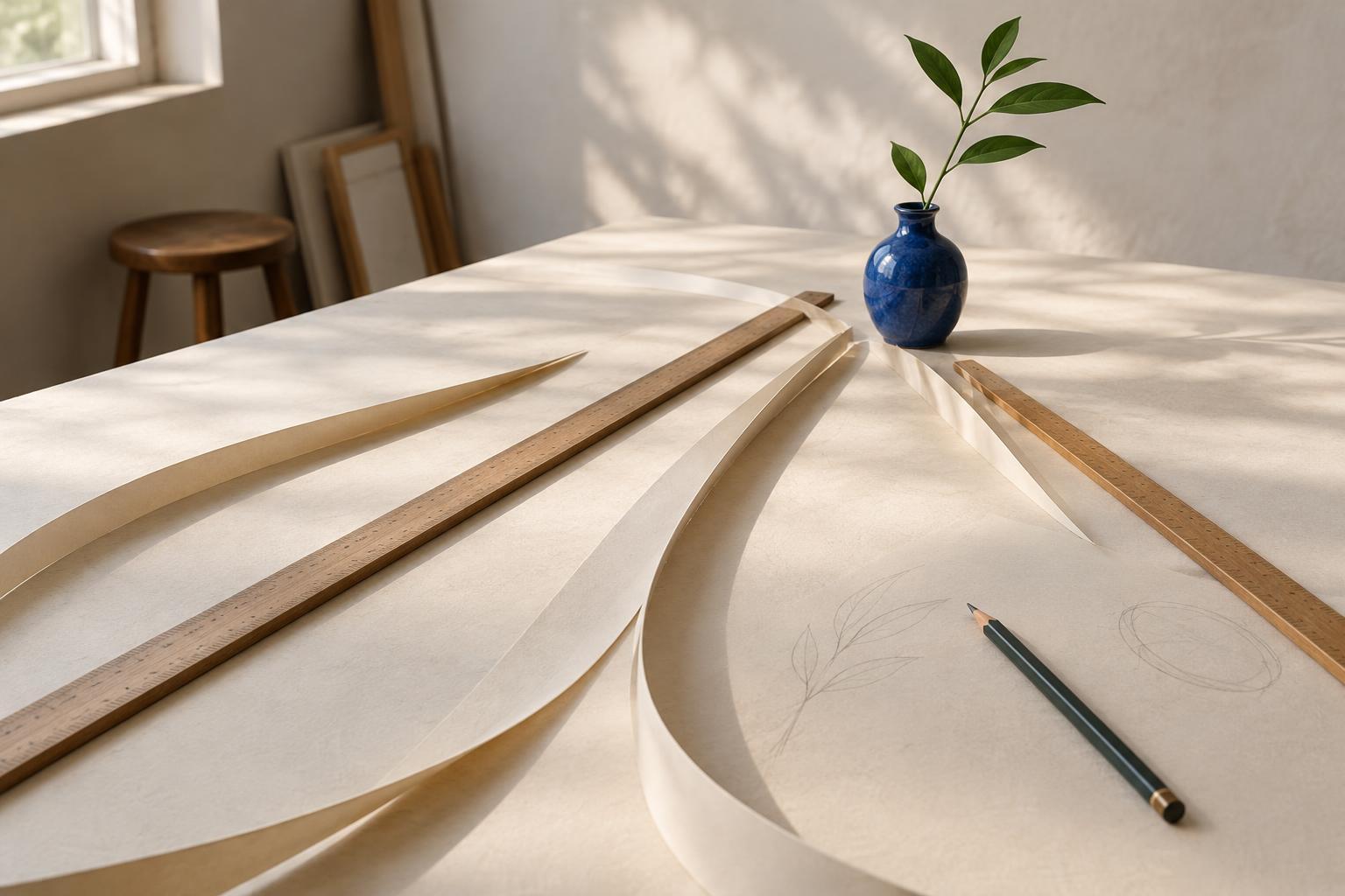
What counts as a leading line?
A leading line is any visible or implied path that encourages the eye to move through a composition. It might be the edge of a road in a photograph, the seam between two areas of color in a painting, or a row of repeated shapes on a poster. The line does not have to be drawn with a pen. Changes in light, texture, spacing, or alignment can create a path just as effectively.
Leading lines are useful because they give the viewer a place to begin and a direction to follow. They can draw attention toward a subject, connect separate parts of an image, or suggest depth on a flat surface. They are not a guarantee that everyone will look in the same order: a bright color or an expressive face may attract attention first. Think of lines as invitations to look, not instructions the viewer must obey.
Start with a destination
Before adding lines, decide what you want the viewer to notice. In a still life, that might be a single cup; in a room illustration, it might be a chair by the window. Once you have a focal point, look for existing edges that could lead toward it. A tabletop, floorboard, shadow, or arrangement of smaller objects may already provide a useful route.
The destination need not sit at the exact center. A line approaching a subject from one side can create a sense of movement while leaving room for the rest of the scene. It can also help to let some paths stop near the subject rather than point directly at it. This gives the viewer a chance to pause and explore instead of making every element feel like an arrow.
If you are working from life or taking a photograph, try changing your position before changing the scene. Moving a step to the side can make two edges appear to meet, or separate lines that have become tangled behind the subject. In a drawing or layout, a small change in the angle or placement of an element can have a similar effect.
Choose a path that suits the mood
Straight lines often feel direct. A path, railing, or strong diagonal can move attention quickly across an image. Parallel lines that appear to narrow into the distance can suggest depth, especially when they are supported by overlapping forms or changes in scale. Diagonals may add energy, while horizontal and vertical paths can feel steadier. These are tendencies rather than rules; the surrounding shapes and colors matter too.
Curved lines offer a slower route. The bend of a branch, the rim of a bowl, or a winding strip of color can lead the eye through several parts of a composition before reaching its focus. Repetition can make a path without a continuous line: a sequence of stones, lights, or marks invites the viewer to move from one to the next.
Consider where a line enters and leaves the frame. An edge that begins near a corner may give the eye an easy starting point. A strong line that runs straight out of the frame, however, may pull attention away from the subject. If that happens, soften its contrast, interrupt it with another shape, or adjust its direction.
Balance guidance with breathing room
A composition can become crowded when every edge competes to lead somewhere. Look for the clearest path and let other lines play a quieter role. You might make the main path darker or more continuous, while allowing secondary paths to fade, break, or turn aside. Empty space can be useful here: it separates visual routes and gives the focal point room to register.
Contrast matters as much as direction. A pale line on a pale background may be present but easy to overlook, while a dark edge can dominate even if it is short. Check whether the strongest contrast supports the route you intended. If your eye keeps settling on an unimportant corner, changing its brightness or simplifying its detail may help more than adding another line.
Test the effect with a small study
To practice, choose an ordinary scene such as a desk, a hallway, or a view through a window. Make three quick thumbnail sketches of the same subject. In the first, emphasize straight edges; in the second, look for curves or repeated objects; in the third, leave more open space around the focal point. Simple shapes are enough. The aim is to compare routes, not to produce finished drawings.
Then look away briefly and return to each sketch. Notice where your eye lands first, where it travels next, and whether it gets stuck or leaves the frame. You can try the same test with a photograph by shifting your viewpoint or cropping it in different ways. Keep the version that supports the feeling you want, even if its path is subtle. Effective leading lines help the viewer discover the image without drawing attention only to themselves.


