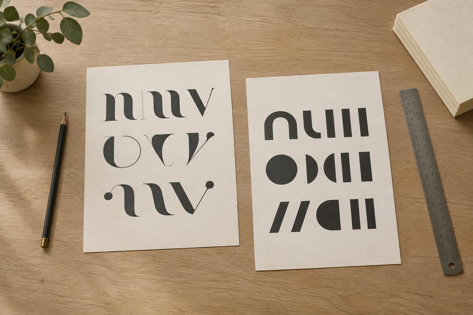
Give each typeface a job
A two-typeface layout often feels busy not because the fonts clash, but because both compete for attention. Before choosing anything, decide what readers should notice first. One typeface might carry headlines and short callouts, while the other handles body text, captions, and practical details. When those roles stay consistent, the reader can learn the page’s visual language without having to think about it.
Start with the text that takes the most effort to read: usually the body copy. Choose a typeface that remains clear at the size and width you plan to use. Then look for a partner that gives headings a distinct character. A striking display face can work well for a few large words, but it may become tiring across long paragraphs. Treat character as an accent rather than something every line needs to express.
Choose contrast with a point of connection
Contrast helps readers tell two typefaces apart. A serif paired with a sans serif is a familiar approach, but the labels alone do not guarantee a good match. Look at the letters themselves: are they narrow or wide, delicate or sturdy, formal or relaxed? Two faces can come from different categories and still share a similar sense of proportion or mood. That connection helps the pairing feel deliberate.
Avoid choosing a second face that is only slightly different from the first. If their shapes and weights are close, the change may look accidental. At the other extreme, two highly decorative faces can both demand to be the focal point. A useful starting point is one expressive face and one quieter face. Try them with your actual words, since a pairing that looks elegant in a sample may behave differently in a long headline or a dense paragraph.
Build hierarchy before adding variety
Typeface choice is only one way to create hierarchy. Size, weight, line spacing, and position can often do more work than another font. Set a clear scale for the main headline, section headings, body text, and captions, then check whether each level is easy to identify at a glance. If a heading needs emphasis, try making it larger or giving it more space before switching its style.
Keep the number of treatments modest. A page with two typefaces can still feel crowded if it uses several weights, italics, all caps, and many sizes without a pattern. Reuse a small set of decisions instead: perhaps one headline style, one subheading style, and one body style. Repetition makes a layout feel coherent, even when the two typefaces have noticeably different personalities.
Let spacing give the pairing room
White space is part of the pairing. Generous margins and clear gaps between sections make contrasting typefaces feel composed rather than crowded. Within paragraphs, line spacing should let the eye move comfortably from one line to the next. Very tight lines can make even a restrained typeface feel dense, while excessive spacing can break the flow of a passage.
Pay attention to alignment, too. A headline and its supporting text often feel more connected when they share a consistent edge. Captions and labels should sit close enough to the content they describe, but far enough from surrounding text to remain distinct. If a layout feels noisy, remove a styling choice or adjust the spacing before replacing either typeface.
Test the pair in a real layout
Make a small sample page with a long headline, a short headline, several paragraphs, and a caption. This reveals problems that a pair of isolated font names cannot: awkward word breaks, headings that take up too much room, or body text that feels faint beside its partner. View the sample at its intended size, whether that is on a phone screen, a printed page, or a poster across a room.
Finally, look away and return to the layout. What catches your eye first? Can you find the main text easily? Does any small element seem louder than the headline? If the answers do not match your intentions, change one thing at a time. A successful pairing is not the most surprising combination; it is one that gives the content a clear voice and lets readers move through it with ease.


