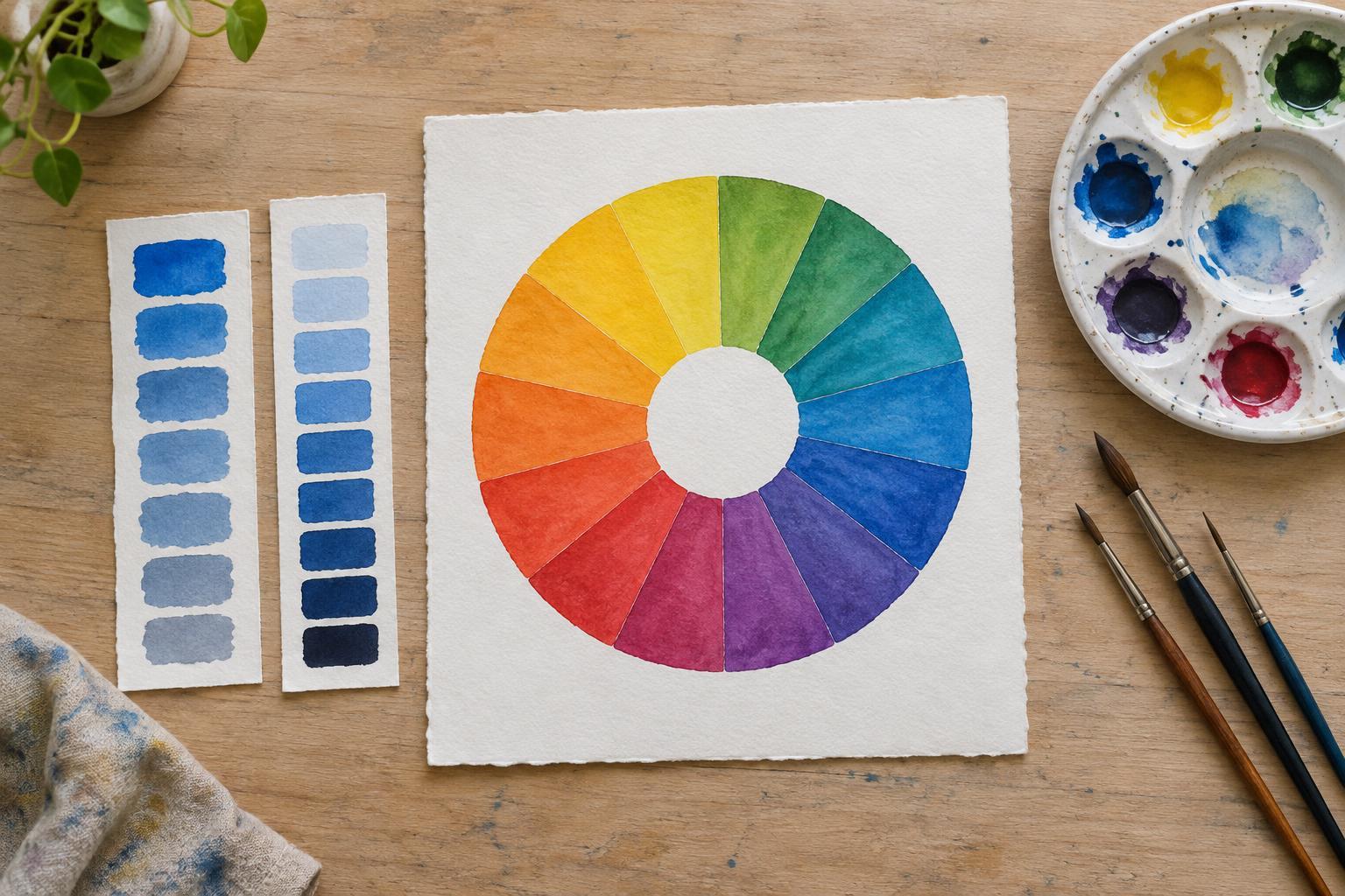
What a color wheel can show you
A color wheel arranges hues in a circle so you can see their relationships at a glance. In a familiar painter’s wheel, red, yellow, and blue provide a starting point, with other hues placed between them. Hues near one another often make a gentle combination; hues across the wheel tend to create a stronger contrast. The wheel is a map for exploring possibilities, not a rulebook for choosing colors.
Different materials and tools use different color systems. Paint mixtures do not behave exactly like colored light on a screen, so a wheel in a painting guide may differ from one in digital design software. You do not need to master every system to begin. The most useful first step is to separate three qualities that are easy to confuse: hue, saturation, and value. Together, they explain much of what makes one color feel different from another.
Hue: which color is it?
Hue is the color family you would name: red, orange, green, blue, or a point between them. As you move around a color wheel, the hue changes. A blue-green and a yellow-green can both be called green, but they lean toward different neighbors. Noticing that lean helps you make more deliberate choices when a color looks almost right but not quite.
The wheel can also help you plan relationships between hues. Choosing several nearby hues, such as blue, blue-green, and green, creates variety without changing direction dramatically. Choosing hues on opposite sides, such as blue and orange, can make each more noticeable. Neither arrangement guarantees a pleasing result. How much of each hue you use, where you place it, and its saturation and value all affect the composition.
Saturation: how vivid is it?
Saturation describes the intensity of a color. A highly saturated red looks vivid and unmistakably red; a less saturated red looks quieter and may approach a grayish red. Saturation is not the same as lightness. A color can be dark and vivid, or pale and vivid, depending on the material and its surroundings. When comparing two samples, ask whether one appears more colorful, not merely brighter.
In a painting, adding a neutral color or mixing with an opposing hue may reduce saturation, though the result depends on the pigments. In digital work, a saturation control offers a more direct adjustment. You can use this quality to guide attention: a small vivid accent may stand out against a field of muted colors. If everything is equally intense, the viewer may have fewer clues about where to look first.
Value: how light or dark is it?
Value describes how light or dark a color appears. Imagine looking at an image in grayscale: the differences that remain are mainly differences in value. A light yellow and a deep blue might have very different values even when both are strongly saturated. Value is especially important for making shapes readable. A subject close in value to its background can be hard to distinguish, even if their hues differ.
To check a composition, try squinting at it or viewing a grayscale version. Large light and dark areas should still make sense when fine details disappear. You can then decide whether to increase contrast around a focal point or keep values close for a softer effect. Remember that surroundings matter: the same patch may seem lighter against a dark background than against a pale one. Judge colors in the setting where you plan to use them.
Put the three qualities to work
Try making a small set of color swatches with paint, colored pencils, or a digital tool. Begin with one hue and make a lighter version, a darker version, and a less saturated version. Label each change. Next, choose a neighboring hue on the wheel and repeat. This short exercise makes it easier to recognize whether a color needs a shift around the wheel, a change in intensity, or a change in lightness.
Use your swatches to plan a simple image, poster, or arrangement of objects on a shelf. Pick a few related hues for the main area, vary their values enough to keep important shapes clear, and reserve a more saturated color for a detail you want noticed. Then change just one quality at a time and compare the results. The color wheel gives you a place to start; observing what each adjustment does is how you make it useful.


