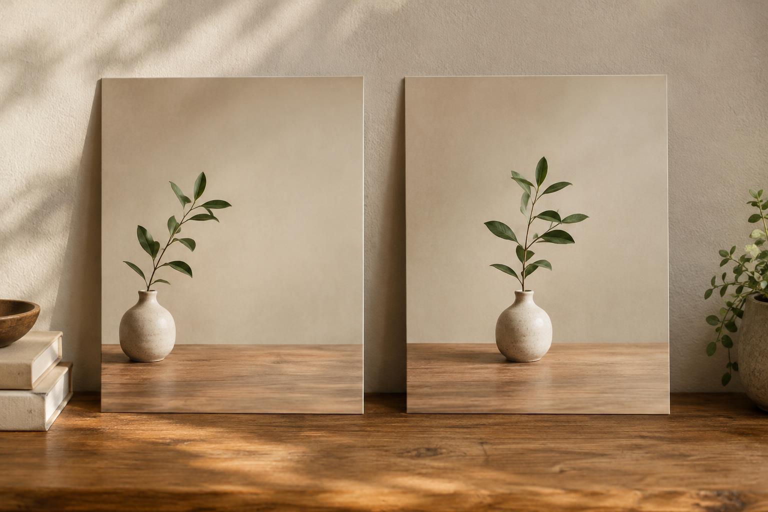
What changes when you move the subject?
Composition is the arrangement of visual elements within a frame. Moving a subject from the middle toward one side changes not only where the viewer looks first, but also how the surrounding space feels. Neither a centered arrangement nor a rule-of-thirds arrangement is automatically stronger. Each offers a different relationship between the subject, the edges and the space around it.
To imagine the rule of thirds, divide a rectangle with two equally spaced vertical lines and two horizontal lines. The lines and their intersections can serve as starting points for placing important features. Centered composition instead places the main subject, or its visual weight, near the middle. These are guides for making decisions, not measurements a finished work must satisfy.
Use the rule of thirds when the surroundings matter
An off-center subject leaves more room on one side of the frame. That space can show context, suggest a direction or give the eye somewhere to travel. In a photograph of a person looking across a room, placing the person near one vertical third can leave space in the direction of their gaze. The room then becomes part of what the image communicates, rather than a background squeezed behind the subject.
The horizontal thirds can be useful when dividing a landscape or an interior. Placing a horizon lower in the frame gives more attention to the sky; placing it higher gives more attention to the ground. You do not need to align it exactly with a grid line. The useful question is which part of the scene deserves more space.
This approach also works in posters and illustrations. An object set to one side can balance a block of text or a contrasting shape on the other. But empty space still needs care: if it contains distracting details or has no clear purpose, an off-center placement may simply make the work feel lopsided.
Choose the center for presence and stability
Centering can make a subject feel direct, still or emphatic. It suits an object whose shape deserves close attention, such as a ceramic vessel, a flower or a chair against a simple wall. It can also reinforce symmetry in architecture or a face-on portrait. Because the space on either side is similar, the viewer may notice small differences in shape, texture and light more readily.
A centered composition need not be perfectly symmetrical or static. A tilted head, uneven shadows or a line crossing the background can create tension within an otherwise stable arrangement. Centering is especially useful when a frame is crowded and moving the subject toward an edge would make it compete with other details.
Consider what surrounds the center, too. A subject can be geometrically centered yet feel off-balance if a dark shape on one side draws more attention than a pale shape on the other. Visual weight depends on contrast, size, color and detail, not just position. Adjusting those elements may do more than moving the subject a few centimeters.
Let the subject and format guide the choice
Before choosing a grid, decide what the viewer should notice first and what they should notice next. If the setting tells an important part of the story, try an off-center arrangement that connects the subject to its surroundings. If the subject itself is the point, try centering it and simplifying the background. A repeated pattern may call for a centered interruption, while a single small object may gain interest from being placed within a larger field of space.
The shape of the frame matters. A wide image can hold generous space beside a subject; a narrow portrait format offers less room to do the same. A composition that feels balanced on a large canvas may change when cropped for a small screen or a square print. Check the intended format before settling on a placement, and look closely at the edges: an accidental sliver of an object can distract from either approach.
You can also combine the two ideas. A person might stand near the center while their eyes sit close to an upper-third line. A centered object might sit below the midpoint to leave breathing room above it. These choices are not contradictions; they are ways to use the frame deliberately.
A simple exercise for finding the better fit
Choose one subject you can move around, such as a mug on a table or a plant near a window. Make two versions from the same viewpoint. Center the subject in one; place it near a third in the other. Keep the lighting and background as similar as possible so you can compare the effect of placement. If you are drawing or designing rather than photographing, make two quick thumbnail sketches before refining either version.
Look at both versions without the grid. Where does your eye go first? Does the surrounding space add information or only pull attention away? Does the centered version feel clear, or does it need more variation? Try changing the crop as well as the subject’s position. The best choice is the one that supports what you want the viewer to experience, even if it lands between a third and the center.


