Start with the message, not the decoration
Visual hierarchy is the order in which parts of a composition attract attention. On a poster, you might notice the event name before the venue. In an illustration, a bright figure might stand out before the quieter landscape around it. Hierarchy does not force everyone to look in exactly the same way, but it gives viewers a useful path through what they see.
Before adjusting colours or moving objects, decide what matters most. Try writing down the one thing a viewer should notice first, followed by what they should find next. A workshop poster, for example, might lead with the workshop title, then the date and place, then a short description. If every element competes for first place, the viewer has to work harder to find the point.
Use size and contrast to create a focal point
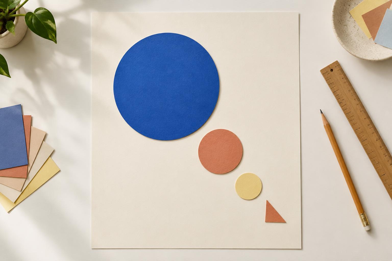
Larger elements often draw attention before smaller ones, especially when they appear among otherwise similar shapes. A generous headline can establish the subject of a page; a large painted form can anchor a composition. Size works best when there is a noticeable difference. Making several elements almost equally large may leave the viewer unsure which one leads.
Contrast is another way to make something stand apart. A dark shape against a pale background, a vivid colour in a muted image or a crisp edge among soft forms can become a focal point. Contrast is relative: a red square may command attention in a field of grey, but less so among several bright colours. Choose one or two strong contrasts for the main message, then let supporting elements be quieter.
Guide the eye with placement and grouping
Where an element sits affects how it is read. An isolated object can feel prominent even when it is small, while an object surrounded by similar neighbours may blend in. You can also guide attention through alignment: placing a headline, image and caption along a shared edge helps viewers understand that they belong to the same sequence. The best placement depends on the shape of the space and the other elements within it.
Spacing helps explain relationships. Items close together tend to look connected; a wider gap suggests a new group or idea. On an information card, keeping a label near its detail prevents viewers from having to search for the connection. Empty space is useful here. It can give an important element room to stand out and make the whole composition feel less crowded, without adding another colour or shape.
Make text and colour support the reading order
When a design includes text, give its different jobs visibly different treatments. A title might be larger or heavier than a subheading, while body text stays comfortable to read. Limit the number of competing text styles so each change has a purpose. A small caption can remain secondary without becoming so faint or tiny that it is difficult to use.
Colour can reinforce that order, but it need not do all the work. If every important detail relies on the same bright accent, the accent stops distinguishing them. Try reserving it for a key heading, action or form. Check that text remains clear against its background, particularly where colours are close in lightness. A design should still offer clues through size, position and wording if colour differences are hard to perceive.
Test what people notice, then simplify
A quick way to check hierarchy is to step back from your work or view it at a smaller size. Ask yourself what you see first, second and third. Does that order match your intention? You can also briefly show the piece to someone else and ask what caught their eye. Their answer is not a verdict on the design, but it can reveal a surprising distraction or a message that is too easy to miss.
If the order feels unclear, change one thing at a time. Reduce an overbearing detail, increase the space around the focal point or strengthen the difference between a heading and its supporting text. You may find that removing an element helps more than adding another effect. A useful hierarchy leaves room for discovery: it makes the starting point clear while allowing viewers to explore the rest at their own pace.


