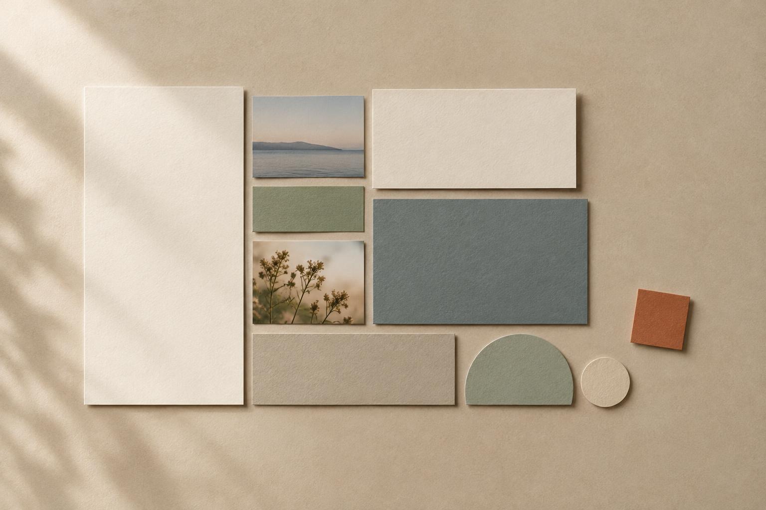
Alignment creates a relationship
A layout can contain all the right elements and still feel unsettled. A title might start slightly to the left of the text beneath it, while an image sits almost—but not quite—in line with both. Each difference is small, yet together they make the elements seem unrelated. Alignment gives them a shared reference point. When a title, image and paragraph begin at the same edge, the eye can recognize them as parts of one arrangement.
That reference point does not have to be a visible line. Designers often work with imagined vertical or horizontal lines running through a page, screen or display. An edge can align with another edge; centers can share an axis; lines of text can sit on a common baseline. These connections provide structure without adding borders or decoration. Alignment helps answer a quiet but important question: which things belong together?
Order does not mean symmetry
A centered invitation can feel formal and balanced because its heading, image and details share a central axis. A magazine page may feel just as organized with everything aligned to the left, even if one side has more open space. Alignment is about consistent relationships, not making both halves identical. An asymmetrical layout can be clear and lively when its elements still follow a deliberate set of edges.
The choice of alignment also affects how someone moves through the layout. A shared starting edge helps readers find the next line or block of information. This can be especially useful when a poster has a heading, event details and a short description: lining up their left edges gives the eye a reliable place to return. Center alignment can work well for a brief message, but several long centered paragraphs may be harder to scan because each line begins in a different place.
Use shared lines to build hierarchy
Alignment works alongside size, spacing and contrast. Imagine a recipe card with a large title, a photograph, an ingredients list and instructions. Aligning the title and text to one edge establishes a main path through the card. Placing the ingredients in a separate, consistently aligned column makes that list recognizable as a distinct kind of information. The arrangement tells the reader where to begin and how the parts are grouped.
An invisible grid can help when a layout has many elements. Start with a few guides, such as an outer margin and two column edges, rather than trying to position every item independently. Elements do not all need to touch every guide. A photograph may span both columns while captions and body text follow one. What matters is that each placement appears connected to the larger structure, rather than accidentally close to it.
Leave room for a purposeful exception
Perfectly repeating an alignment can make a layout calm, but it can also make every element seem equally important. A deliberate break can draw attention to one item: a short quotation set slightly outside the text column, for instance, or a small label placed above an image. The exception works best when the underlying pattern is clear. Without that pattern, the shifted element may look like a mistake rather than an emphasis.
Before breaking an alignment, decide what the change should communicate. Is the element a starting point, a separate note or a visual pause? Then check its other relationships. A label that does not align with the body text might still align with an image edge. Giving an exception at least one clear connection helps it feel intentional.
A simple way to check a layout
To assess a page, poster or slide, temporarily ignore its colors and subject matter. Look only at the outer edges of text blocks, images and shapes. Which edges seem close enough to suggest a connection but do not quite meet? Either align them or separate them more clearly. Near-misses can be more distracting than an obvious difference because they leave the relationship uncertain.
The same approach works beyond the page. In a gallery wall at home, frames might share a top edge, a center line or a consistent gap. On a shelf, the edges of books and objects can create a loose rhythm without forming a rigid row. Begin with one or two reference lines, then step back to see whether the arrangement is easy to take in. Alignment should support what you want people to notice, not become a rule you follow at the expense of a comfortable, expressive layout.


