What balance means in a composition
A composition feels balanced when its parts seem to hold together rather than pulling attention unintentionally toward one area. Balance does not require equal amounts of everything. It concerns visual weight: how strongly a shape, color, texture or object attracts the eye. A small dark circle may draw as much attention as a larger pale shape. An isolated object can seem more prominent than the same object in a crowded group.
Symmetrical and asymmetrical balance offer two different ways to manage that weight. Both can create a satisfying image, page or room arrangement. The useful question is not which type is better, but what kind of experience you want someone to have when looking at it.
Symmetrical balance: order around an axis
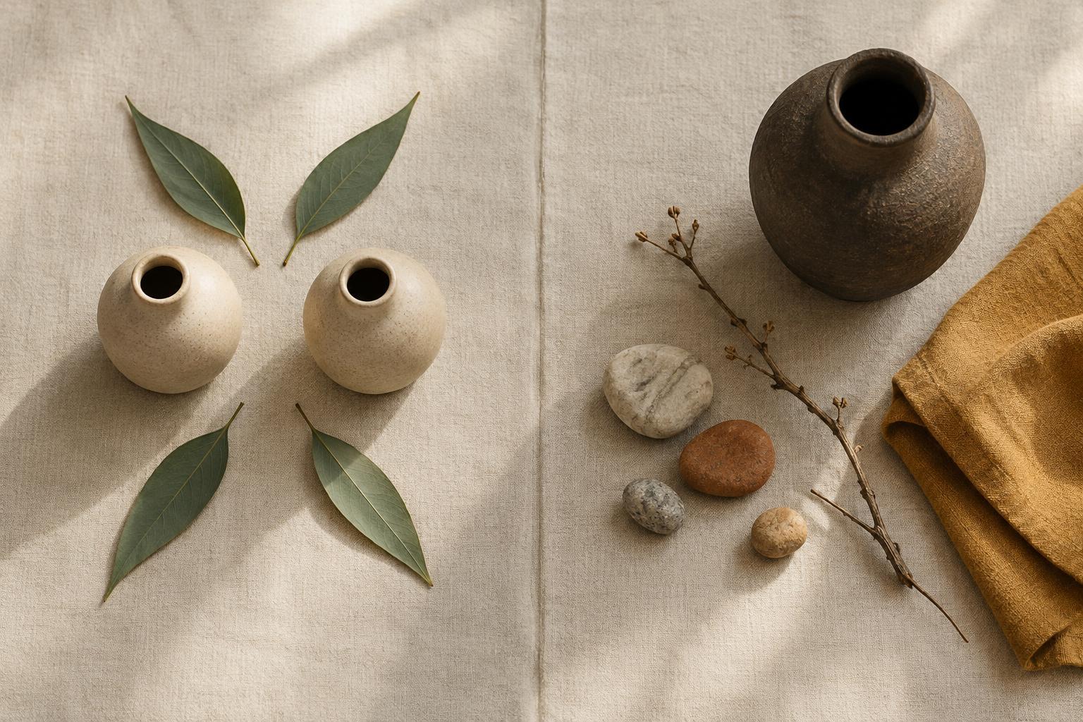
A symmetrical composition distributes similar visual weight on either side of a central line, often called an axis. Imagine folding a picture down the middle: in exact mirror symmetry, the two sides would match. Many compositions use looser symmetry instead. Two chairs may differ in detail but still balance a table between them, or two blocks of text may frame a centered image without being identical.
Symmetry makes a center easy to find. It can convey steadiness, formality or calm, especially when repeated shapes and even spacing reinforce the structure. This makes it useful for a portrait with a centered subject, a poster built around a clear headline or a display in which one object should receive particular attention.
The risk is that a highly predictable arrangement may feel static when you want movement or surprise. To keep symmetry engaging, vary details without losing the overall structure. Changes in texture, shape or scale can reward a closer look while the composition remains grounded.
Asymmetrical balance: different parts, equal pull
An asymmetrical composition balances unlike elements rather than reflecting them. A large, quiet shape on one side might be countered by a small, vivid shape on the other. A single object placed far from the center may balance a cluster of objects closer to it. The sides need not look alike; they only need to feel as though neither overwhelms the whole.
Several qualities affect visual weight. Strong contrast tends to attract attention, as can saturated color, sharp detail, unusual shapes and generous empty space around an object. Placement matters too: an element near an edge can create a sense of pull or tension. These are useful observations, not fixed rules. Context changes how prominent any element feels.
Asymmetry can suggest movement and invite the eye to travel through a composition. In a photograph, a person on one side might face into an open stretch of sky. In a page layout, a large image could be balanced by a compact headline and a column of text. The empty areas in both examples are active parts of the arrangement, not spaces that must be filled.
How to choose and test an arrangement
Start with the main point of attention. If you want a direct, settled presentation, try centering it and building a symmetrical structure around it. If you want the viewer to notice several elements in sequence, move the focal point away from the center and explore asymmetrical balance. Neither approach has to be strict: a mostly symmetrical design can contain one deliberate interruption.
To test an arrangement, look at it from a distance or reduce it to a small sketch. At that scale, fine details recede and larger areas of visual weight become easier to compare. Ask where your eye goes first, where it goes next and whether it gets stuck. If one corner feels too heavy, you might shift an object, soften its contrast or give another area a little more presence.
Try changing one thing at a time. Moving an element, adjusting its size or adding space around it can alter the balance without requiring a complete redesign. Pause between changes so you can tell what each adjustment accomplishes.
Using balance in everyday spaces
These principles work beyond drawings and graphic layouts. On a shelf, matching objects placed on either side of a central piece create an orderly, symmetrical display. A tall vase at one end might instead balance a lower group of books and small objects at the other. On a wall, one large artwork can hold its own beside several smaller pieces if their combined weight feels comparable.
Pay attention to the setting as well as the objects. A doorway, lamp or strong patch of color nearby may influence how an arrangement feels. Leave room to experiment rather than aiming for a perfect formula. Balance is something you can observe and adjust: the arrangement should support what you want people to notice and the mood you want the space or image to hold.


