Why closeness changes what we see
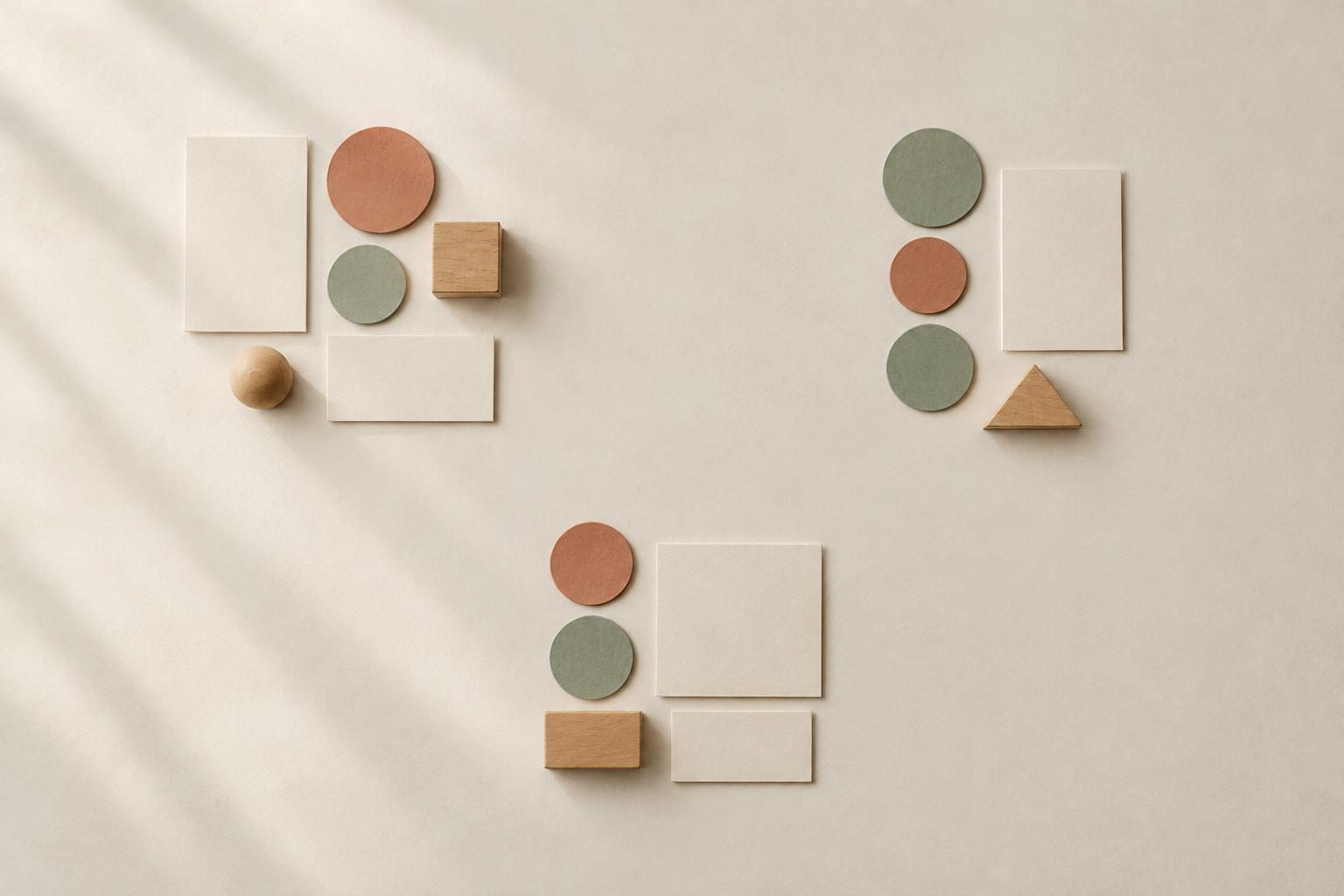
Put a photograph beside its caption, and most viewers will understand that the words describe the image. Move the caption halfway across the page, and that relationship becomes less certain. Nothing about the photograph or the words has changed; only the space between them has. This is the principle of proximity: elements that sit close together tend to appear related.
Proximity helps people make sense of a composition before they read every word or examine every detail. It can distinguish one group from another, suggest where to begin and make a busy arrangement feel easier to navigate. The principle applies to posters, web pages and books, but also to a row of framed pictures or a collection of objects on a shelf. It is not a fixed rule about exact distances. What matters is whether the spacing makes the intended relationships clear.
Give each group a clear boundary
Imagine a page with three short instructions, each paired with an illustration. If every image is equally distant from the instruction above and the one below, viewers may have to work out which pairing is correct. Keeping each image close to its own text, then leaving a larger gap before the next pair, creates three distinct units. The space within a group says “these belong together”; the space between groups says “a new unit begins.”
You can use the same approach without drawing boxes or adding dividing lines. On an invitation, keep the venue name with its address and the start time with any arrival details. In a display of small artworks, leave modest gaps between pieces that form a series and a more noticeable gap before a different series. Empty space is doing useful work: it separates ideas while allowing the arrangement to remain open and uncluttered.
Build a spacing pattern, not a collection of guesses
A reliable way to apply proximity is to choose a small set of spacing relationships. For example, use the tightest gap between a heading and its explanation, a medium gap between separate items, and the largest gap between sections. The measurements can change with the format; their relative sizes are what create a readable pattern. If every gap is slightly different, viewers may see inconsistency rather than a deliberate structure.
Begin by identifying the groups in your content before moving anything around. Ask which label belongs to which picture, which details support a heading, and which elements should stand on their own. Then arrange the closest relationships first. Step back and look at the whole composition: can you spot the groups without reading the text? If not, widen the spaces between groups or tighten the spaces within them. A few purposeful changes often do more than adding decorative separators.
Use proximity alongside other design cues
Spacing works best when it agrees with the rest of the design. If a caption is close to an image but aligned with a different image, the two cues compete. Consistent alignment can reinforce the grouping created by proximity. Similar type styles or colors can also connect related items, especially when a layout has limited room for generous gaps. These cues should support the relationship rather than ask viewers to solve a puzzle.
Proximity does not mean crowding. Text still needs room to be read, and objects need enough space for their shapes to remain distinct. Nor should every related item be packed into one dense cluster. A title may introduce an entire page while sitting farther from a particular paragraph than that paragraph’s subheading does. Think in levels: small distances can connect details, while larger distances can organize the groups those details form.
Test the grouping in the place it will be seen
A layout that seems clear on a large screen may feel compressed on a phone. A grouping that works on a tabletop may disappear when viewed from across a room. Check your composition at its likely viewing size and distance. Try glancing at it briefly rather than studying it: which elements appear to belong together first? If that impression differs from your intention, adjust the spacing before changing the content.
For a simple practice exercise, arrange a title, two images and two captions on a page. Make one version with even gaps everywhere and another with each caption closer to its image than to the next pair. Compare how quickly you can identify the relationships. Proximity is most useful when it feels almost invisible: the viewer understands the arrangement without needing to notice the spacing that made it clear.


