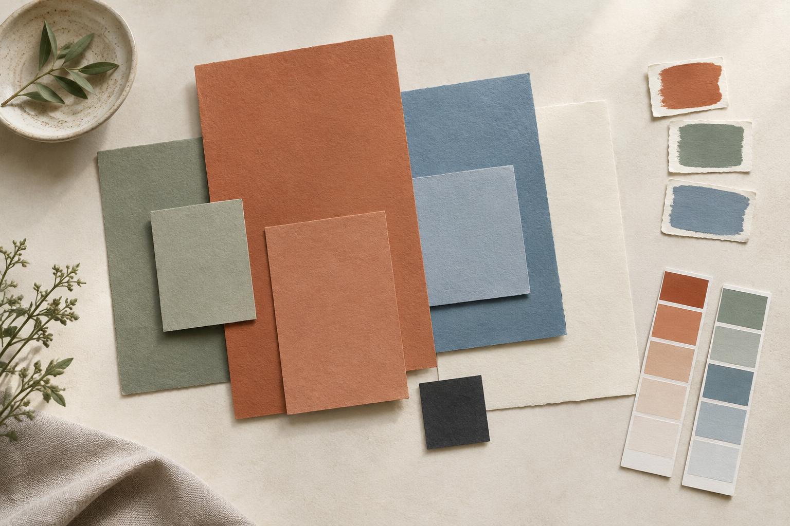
Start with a purpose, not a color chart
A limited color palette is a small group of colors used consistently across a design. It can help a poster, room, illustration or website feel connected because the same visual cues appear throughout. Limited does not have to mean dull: a few well-chosen colors can offer plenty of variety when their lightness, intensity and placement change.
Before selecting colors, decide what the design needs to communicate. Should it feel quiet and spacious, energetic and playful, or warm and welcoming? Then consider where the colors will appear. A bright accent that works beautifully on a small invitation may feel overwhelming across an entire wall. Collecting a few visual references can help you describe the effect you want, but aim to identify what appeals to you rather than copy every color you see.
Choose an anchor and give each color a role
Begin with one anchor color that suits the subject or setting. It might come from a material you must use, an image at the center of the design or a color you simply want to explore. Add a neutral or restrained supporting color for larger areas, then choose one contrasting or more vivid color to draw attention. This gives you a workable starting palette of two or three colors; you can add another if the design needs it.
Assigning roles matters more than finding a perfect mathematical combination. One color might carry backgrounds, another might define headings or major shapes, and an accent might highlight the most important detail. If every color competes for attention, the palette may feel less cohesive even when the colors look attractive side by side. Try using the accent sparingly at first, then increase it only where it helps guide the eye.
You can also build variation without adding new hues. A darker version of the anchor can give text or outlines more weight, while a pale version can soften a large area. Keep these variations recognizably related, and check that they remain distinct enough for their intended jobs.
Check value and intensity as well as hue
Hue names the color family, such as blue or orange. Value describes how light or dark a color appears, while intensity describes how vivid or muted it feels. A palette can contain very different hues yet look flat if all of them have similar values. Conversely, several shades of one hue can create clear structure when one is light, one is mid-toned and one is dark.
A quick test is to view a rough layout in grayscale. If the focal point disappears or important elements blend into their backgrounds, adjust the light-dark relationships. Then return to color and look at intensity: a vivid accent is often easier to notice when the surrounding colors are quieter. This is not a rule that every design must follow, but it is a useful way to control emphasis.
For text, buttons, labels and other functional details, visual harmony is not enough. Make sure essential information is easy to distinguish from its background at the size and in the setting where it will be used. Color alone should not have to carry an important instruction or distinction.
Test the palette in a real layout
Colors influence one another. A warm gray may seem neutral beside cream but cooler beside rust; a small swatch can look very different when it fills a page. Instead of judging colors only in a row of samples, place them into a rough version of the actual design. Include large surfaces, small accents, text and any photographs or materials that will remain.
Make a few quick variations by changing which color is dominant, not just by swapping hues. You might try a light background with dark details, then reverse them. Step back to see the overall balance and look closely to check whether the most important information is clear. If the design will appear in print and on screen, test both when possible; they may not present the colors in quite the same way.
Refine by removing, then document what works
When a palette feels busy, look for a color that has no clear role. Removing it may do more for cohesion than finding a better replacement. If the result feels too uniform, introduce contrast through scale, texture, spacing or value before adding another hue. These choices can create variety while letting the palette stay focused.
Once the design works, record the colors and their intended uses in a simple note or sample sheet. Include any lighter or darker variations you rely on. This makes it easier to repeat the palette across related pieces without treating it as a rigid formula. A cohesive palette is not one that never changes; it is one whose colors continue to support the same visual purpose.


