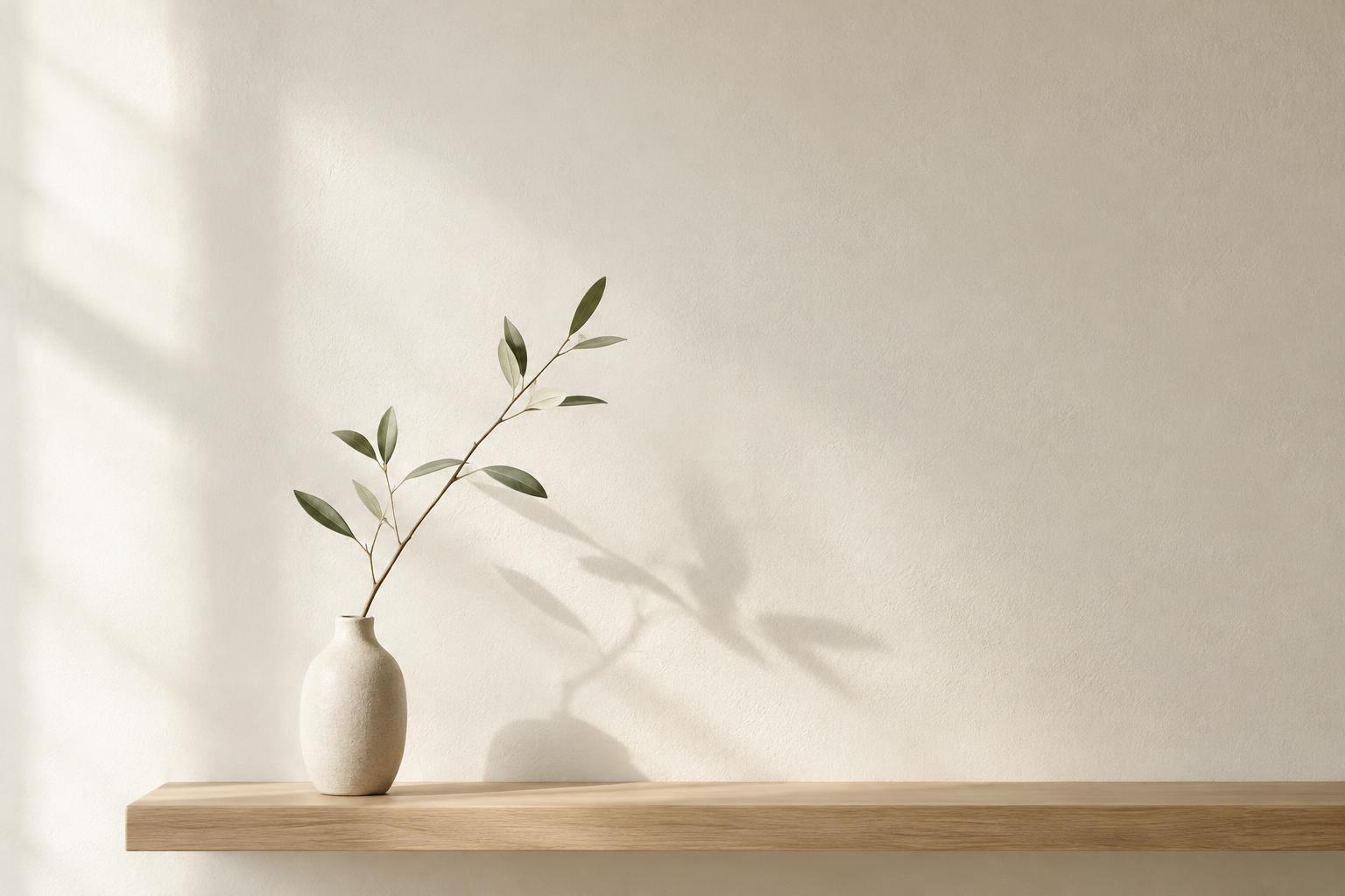
The space around a subject is part of the picture
When looking at a drawing, poster, or photograph, it is natural to notice the subject first. The figure, object, or line seems to be where the composition happens. Yet the areas around and between those elements help determine how we see them. Designers and artists call these areas negative space. It can be a blank wall behind a chair, a stretch of sky above a roof, or the gap between two letters.
Negative space does not have to be white or empty. It might contain color, texture, or soft shadows. What matters is its relationship to the more prominent forms, often called positive space. A dark shape against a pale background is easy to recognize, but so is a pale opening between two dark shapes. Both the object and its surroundings contribute to the image.
Why open areas can make an image feel clearer
A composition with many closely packed elements asks the eye to sort through them. This can create energy, but it can also make the main idea harder to find. Giving a subject some surrounding space separates it from nearby details. In a poster, for example, room around a headline can help distinguish it from supporting text. In a still life, space between objects lets each silhouette become more legible.
Open areas also influence pace. A viewer may move quickly through a busy cluster of marks and pause at a broad, quiet area. That contrast can make a small subject feel deliberate rather than lost. More space is not always better, however. If the subject feels disconnected from everything around it, the composition may seem unfinished. The aim is to choose how much separation serves the work.
Notice the shapes made by the gaps
One way to use negative space is to stop treating it as leftover background. Look instead at the shapes it forms. A vase handle creates an enclosed opening. Two buildings frame a strip of sky. The space between a person’s arm and body has its own outline. If that outline is awkward or unexpectedly narrow, it may draw attention even when the surrounding objects are well rendered.
Try sketching the gaps rather than the objects in a simple arrangement. Place two cups on a table and draw the shape of the space between them, then the space above their rims. This exercise shifts attention from what the objects are to how their edges relate. It can be especially helpful when a drawing feels slightly off but you cannot tell which object needs adjusting.
Use space to guide attention and create balance
Negative space can suggest direction. A person positioned at the left edge of a photograph with open space in front of their gaze may seem to be looking into the scene. Put the same space behind them, and the image can feel different: the viewer may wonder what has been left behind or feel that the figure is moving out of the frame. These are possibilities to explore, not fixed rules.
Balance does not require equal amounts of space on every side. A small, detailed form can hold its own against a large quiet area because the detail attracts attention. To test a composition, cover or crop part of the open area and notice whether the subject feels cramped, steadier, or less distinct. Small changes to a margin or gap can alter the overall effect.
Practice with a page, a photograph, or a shelf
Start with something you can rearrange. On a page, make three small compositions using the same circle and two lines. Leave different amounts of space around the circle each time. In a photograph, take several frames of one object without changing the object itself; move your camera so the space above, beside, and beneath it changes. Compare where your eye lands first in each version.
The same principle works beyond a page or screen. On a shelf, try removing one item before adding another. Notice whether the remaining objects are easier to see and whether the gaps between them feel varied or repetitive. Negative space is not a command to keep everything sparse. It is a way to make the areas between things as intentional as the things themselves.


