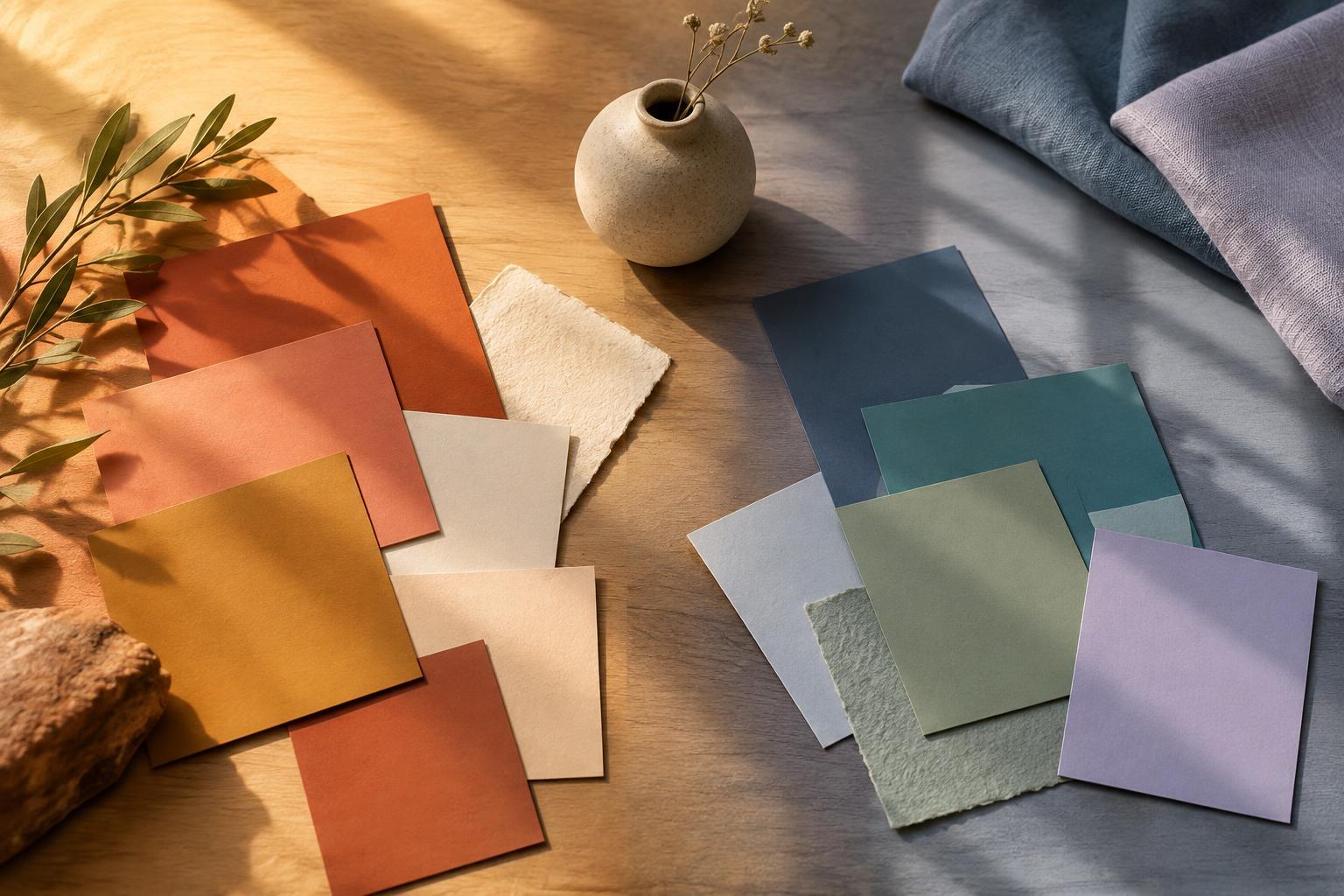
What makes a color feel warm or cool?
Warm colors are usually associated with reds, oranges and yellows; cool colors with blues, greens and violets. The distinction can help describe a palette quickly, but it is not a fixed rule. A yellow-green may feel warmer than a blue-green, while a violet with a strong red cast may feel warmer than one leaning toward blue. Even a gray or white can appear warm or cool depending on its undertone.
Temperature is also relative. Place a muted terracotta beside a bright orange and it may look cool by comparison. Move the same terracotta next to a slate blue and its warmth becomes obvious. When choosing colors, compare them side by side rather than judging each swatch in isolation. What matters in the finished design is how the colors behave together.
How temperature shapes mood and attention
Warm colors often lend energy and a sense of closeness. A small amount of coral can make a poster feel welcoming; a broad area of saturated red may feel more urgent. Cool colors often suggest quiet, clarity or distance. A pale blue background can give text and images room to breathe, while a deep blue may create a more restrained atmosphere. These are useful tendencies, not universal reactions. Brightness, saturation, subject matter and personal associations all affect how a design feels.
Temperature can also guide the eye. A warm accent against a predominantly cool setting may draw attention to a button, title or focal object. The reverse can work too: a cool shape can stand out within a warm composition. The strongest contrast is not always the most useful one, however. If every element competes for attention, the viewer has little guidance. Decide what should be noticed first, then give that element a distinct color relationship.
Using warm and cool colors to suggest space
In many compositions, warm colors can seem to come forward while cool colors appear to recede. An illustrator might use a warm foreground against cooler distant shapes to give a flat page a sense of depth. In a room, warm-toned furnishings against cooler walls can make the furnishings feel more prominent. Scale, lighting and contrast can strengthen or weaken the effect, so color temperature works best as one tool among several.
A palette does not need equal amounts of warm and cool color. A mostly cool design with one warm accent may feel open and focused; a mostly warm design with a few cool notes can feel rich without becoming visually crowded. Neutral colors help create pauses between stronger hues. Cream, charcoal and gray are not automatically temperature-free: choosing a neutral with a compatible undertone can make the whole arrangement feel more deliberate.
Building a palette with a clear purpose
Start by naming the effect you want rather than picking favorite colors at random. For a quiet reading corner, you might try a soft cool wall color, warm wood and a small accent in rust. For an energetic event flyer, a warm background might carry the mood while a cooler accent separates key details. Make a few quick versions before settling on one; changing which color dominates can alter the result more than changing the colors themselves.
Next, check the palette in its intended setting. A color seen on a bright screen may look different when printed, painted or viewed under a warm lamp. Materials matter too: a glossy surface reflects light differently from a matte one. If you are working on a physical space or object, test a sample where it will be used. For a digital design, view it at different sizes and against the surrounding content.
Let color support the design, not carry it alone
A warm–cool contrast can clarify a composition, but it should not be the only way important information is communicated. If a chart, sign or interface uses color to distinguish parts, add labels, shapes or other visual cues. Check that text remains easy to read against its background; a pleasing palette will not help if the contrast is too weak. Viewing a draft in grayscale can reveal whether its hierarchy still holds without the hues.
Finally, consider the people and setting the design is for. A vivid orange that feels cheerful on a small invitation could feel overwhelming across an entire wall. A cool blue that suits a spacious layout might make a compact space feel stark if there are no softer elements. Warm and cool colors are most effective when their proportions, surroundings and purpose work together. Use them to make intentional choices, then trust what you can see in the finished arrangement.


