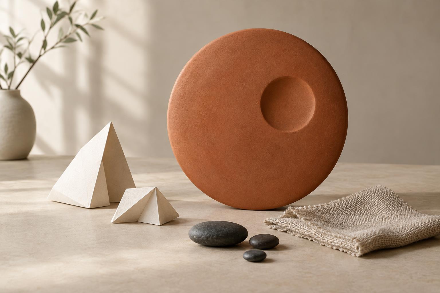
Contrast gives the eye a place to start
When every element in a composition looks equally important, viewers may struggle to find a starting point. Contrast creates visible differences: one form is larger, another has a sharper outline, and a third has a rougher surface. These differences help people distinguish elements and sense which ones belong together. You can use contrast in a drawing, a page layout, a shelf display, or an arrangement of prints on a wall.
Contrast does not mean making every difference dramatic. Its purpose is to support a clear visual hierarchy: what should someone notice first, next, and last? A single strong difference can do more work than several competing effects. Before changing a composition, decide which element needs emphasis and which elements should play a supporting role. That decision makes it easier to choose the right kind of contrast.
Use size to establish importance and rhythm
A larger element often attracts attention before a smaller one, especially when the two sit close together. Try making a central image noticeably larger than its surrounding details, or placing one broad form among several small marks. The smaller elements can provide context without competing for the first glance. Repeating a size difference also creates rhythm: a large shape followed by a few small ones can lead the eye across a composition.
Size works best when there is enough space to perceive the difference. A large object squeezed against the edges of a layout may feel crowded rather than prominent. Likewise, a small element can become conspicuous if it sits alone in generous empty space. Check your work from the distance at which it will usually be seen. A distinction that seems obvious while you are arranging small pieces at a desk may fade when the finished display is viewed from across a room.
Change shape to separate roles
Shape contrast helps distinguish elements even when they are similar in size or color. A circle among rectangles, an irregular cutout beside straight-edged forms, or a curved line crossing a field of angles can stand apart quickly. This makes shape useful when you want a focal point but do not want to enlarge it. In an illustrated guide, for example, a rounded marker might identify an action while rectangular panels hold the explanatory material.
Differences in shape can also suggest relationships. Repeated forms tend to feel like members of the same group, while a change in outline can signal a different role. Keep those roles consistent where clarity matters: if one shape marks a particular kind of item, using it for unrelated items may weaken the cue. You need not make every supporting form identical. A shared family resemblance, such as mostly straight edges or similar proportions, can provide unity while leaving room for variation.
Let texture add depth without creating clutter
Texture can be physical, like the grain of wood against smooth ceramic, or visual, like dense pencil marks beside an open area of paper. A textured region can draw attention because it contains more detail for the eye to explore. Conversely, a smooth area can stand out when everything around it is busy. If you are composing a still life, try placing a woven object next to a plain vessel. In a drawing, try reserving fine marks for the area you want viewers to inspect.
Texture is most useful when its effect remains visible at the intended scale. Tiny surface details may disappear in a small reproduction, while heavy patterns can overwhelm nearby shapes. Try squinting at the composition or looking at it from farther away. If the main subject vanishes into a field of competing marks, simplify some supporting areas. Leaving parts of a work quiet gives textured passages more room to register.
Combine contrasts with a clear priority
Size, shape, and texture can reinforce one another, but they need not all peak in the same place. A large smooth form may stand apart from a cluster of small textured forms; an unusual shape may remain distinct even with a restrained surface. Begin by choosing one primary contrast, then use the others to clarify rather than intensify everything. This helps preserve both emphasis and variety.
For a quick test, arrange three to five elements on a page or shelf. Choose one as the focal point, then adjust only size, shape, or texture until it reads clearly. Step back and ask what you notice first and whether the remaining elements are easy to distinguish. If your eye jumps between several equally forceful areas, reduce one difference rather than adding another. Effective contrast is not a contest for attention; it is a way to make a composition easier and more rewarding to explore.


