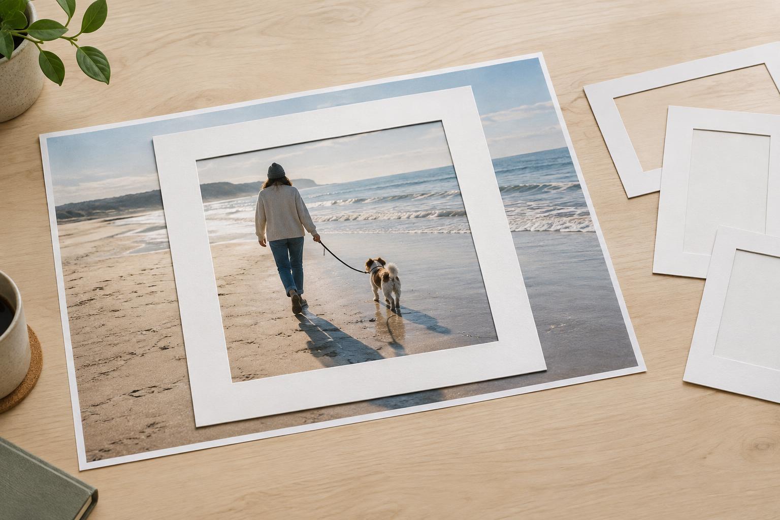
Decide what the image needs to communicate
Cropping changes more than an image’s shape. It directs attention, alters the relationship between objects, and can change what a viewer understands. Before moving the crop handles, describe the image’s purpose in one sentence. A photograph of a handmade chair might need to show its overall form; a close-up for a materials guide might need to show the joinery. Those purposes call for different frames, even when they start with the same photograph.
Identify the visual information a viewer needs to make sense of the image. That might include a person’s hands demonstrating a technique, the shadow that reveals an object’s shape, or a nearby item that establishes scale. Then distinguish those details from background space that adds little. Removing distractions can strengthen a composition, but removing a useful clue can leave the subject confusing or misleading.
Protect relationships, not just objects
An important element does not always have to be fully visible, but its relationship to the main subject should remain understandable. In a portrait, the direction of a person’s gaze can make the space beside them feel purposeful. In an image of a workspace, the distance between a tool and the material being worked on may help explain the activity. A crop that preserves every object but squeezes out the space between them can still lose the story.
Look at the original image and ask what each visible element contributes. If you remove a doorway behind a sculpture, will viewers still understand where it sits? If you crop a drawing to emphasize one mark, will the remaining marks still provide useful context? There is no rule that every photograph needs a wide view. The useful test is whether the tighter frame supports the message you intend to convey.
Pay particular attention to partial objects at the boundary. A deliberate close-up can feel confident, while a narrow sliver of an unrelated object may look accidental. If an edge falls just short of a recognizable feature, try including more of it or excluding it completely.
Choose the shape, then refine the frame
The space where an image will appear often determines its aspect ratio: a wide banner, a square thumbnail, and a vertical page image each leave room for different details. Set that shape before making fine adjustments. Otherwise, a composition that looks right in a flexible editing window may fail when it is placed in its final space.
Start with a generous crop and move its boundaries inward gradually. Keep the main subject easy to find, then check whether surrounding space helps it breathe or competes for attention. Centering can make a symmetrical object feel stable, while placing a subject off-center can leave room for movement, gaze, or a second point of interest. Use these as options rather than fixed rules; the strongest arrangement depends on the image.
If one source image must work in several shapes, make separate crops rather than forcing a single frame into every placement. A thumbnail may need a simpler view than a large image within an article. If a required shape cannot hold the essential information, consider using a different photograph or adjusting the layout instead of cutting away something important.
Check the edges at the size people will see
Once a crop looks balanced, inspect all four edges. Check for awkward cuts through faces, hands, lettering, and distinctive parts of objects. A cut through a person’s arm or the leg of a chair is not automatically wrong, but it should feel intentional. Leave enough room around important details that a small change in display size will not make the frame feel cramped.
Next, view the image at approximately its intended display size. Fine details that seemed clear while editing may become hard to recognize in a small card or thumbnail. If a label, gesture, or material texture is essential, make sure it remains legible or provide that information in the accompanying text. Also check image quality after cropping: a very tight selection from a small original may look soft when enlarged.
If the image contains words, diagrams, or work by another artist, be especially careful not to crop away information needed to interpret them. A caption can add context, but it should not be used to excuse a crop that changes what the image appears to show.
Compare versions before committing
Save the original and make a few crop variations. Compare them quickly, then step away for a moment and return with a simple question: what would someone notice first without having seen the full image? This helps reveal when a crop has made a secondary detail seem central or removed the context that made the subject interesting.
A successful crop does not preserve the most pixels or follow a composition formula perfectly. It keeps the information needed for the image’s purpose, removes what weakens that purpose, and gives the remaining elements enough space to make sense together. When in doubt, choose the frame that communicates clearly over the one that merely looks dramatic.


