Why paper changes the painting experience
Watercolor paper is more than a surface that holds a picture. It influences how long a wash stays workable, whether an edge looks soft or crisp, and how the sheet responds when you add water again. Two paints can behave noticeably differently on two papers, even when the brush and technique stay the same.
A paper label usually gives you several clues: weight, fiber content, surface texture, and sometimes the type of sizing. None tells the whole story on its own. A useful way to choose is to think about how much water you use, whether you work in layers, and how much you want to spend while practicing. Understanding three terms—weight, sizing, and fiber—makes those choices easier.
Weight: what the number tells you
Paper weight is commonly given in grams per square meter, or gsm. This measures the mass of a standard area of paper, not its exact thickness. Higher-weight sheets are generally sturdier and less prone to buckling when wet, although construction and painting technique matter too. You may see lighter watercolor papers around 190 gsm, a widely used middle option around 300 gsm, and heavier sheets around 640 gsm.
If you paint with small brushes and relatively little water, a lighter sheet may be sufficient, especially for studies. Broad wet washes place more strain on the paper. A 300 gsm sheet is a practical starting point for many beginners because it offers some resilience without the cost of the heaviest options. Very heavy paper can be pleasant for water-rich work, but weight alone does not guarantee a surface you will enjoy.
Even sturdy paper can move as it absorbs water and dries unevenly. Working on a flat surface, allowing layers to dry, and securing the edges when appropriate can help manage buckling. If you plan to stretch paper, check that the sheet and your mounting method are suitable before wetting an entire piece.
Sizing: the less visible ingredient
Sizing is a treatment that limits how readily paper absorbs water. Without enough sizing, paint may sink in quickly and spread in ways that are hard to control. With effective sizing, pigment has more opportunity to move across the surface before settling. This can make it easier to create a smooth wash, soften an edge, or lift some color after it has dried. Results also depend on the pigment and how long it has been on the paper.
Sizing may be added within the sheet during manufacture, applied to its surface, or both. Formulas vary and may use animal-derived or synthetic materials. If avoiding animal-derived products matters to you, check the maker’s information rather than assuming a cotton or cellulose label answers that question. Two papers with the same fiber content can feel very different because their sizing differs.
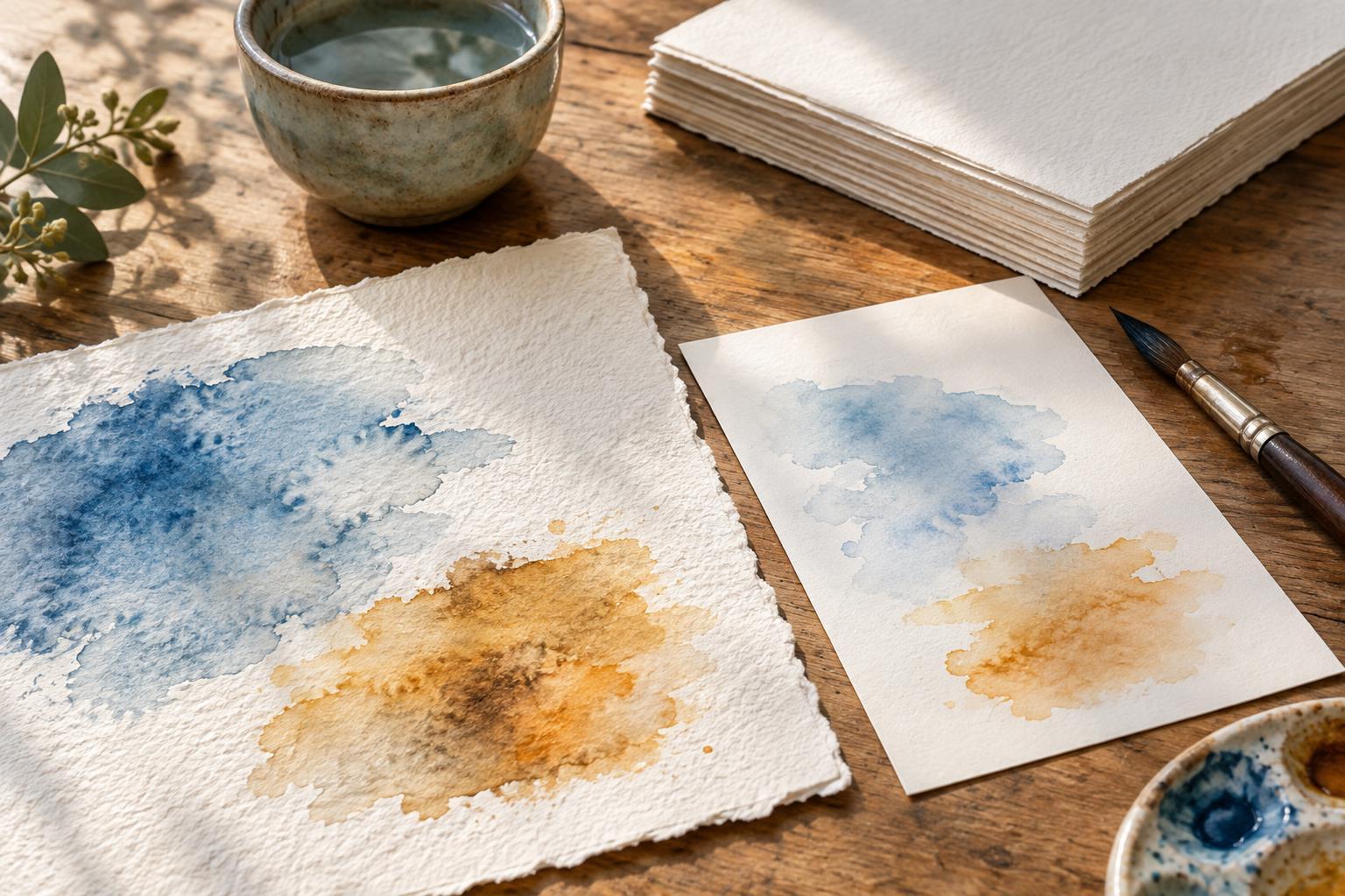
You can learn a great deal from a small test. Place a clean-water stroke on a sample, then add a little paint beside it. Notice whether the water remains near the surface or disappears quickly, how far the color travels, and whether a damp brush can lift a dried mark. These observations are often more useful than trying to judge quality from a label alone.
Cotton versus cellulose
Cotton watercolor paper is made partly or entirely from cotton fibers; check the label if you want to know the proportion. It is often chosen for layered painting and repeated wetting because well-made cotton sheets can remain workable and hold up to careful reworking. They also tend to cost more. Cotton is not a promise that every brushstroke will be easy: sizing and surface texture still shape the experience.
Cellulose paper is generally made from plant fibers such as wood pulp. It offers an accessible way to practice, make color studies, or keep a sketchbook without treating every sheet as precious. Some cellulose papers handle light washes well, while others absorb water quickly or become less forgiving after repeated brushing. Paper quality varies within both fiber categories, so a good cellulose sheet may suit your work better than a cotton sheet whose surface you dislike.
For a fair comparison, paint the same small exercise on each: one flat wash, one layered passage, and one lifted highlight. Let each stage dry before judging it. The best paper is not necessarily the most expensive one; it is the one whose behavior supports what you want to do.
Putting the choices together
Texture is one final consideration. Hot-pressed paper is relatively smooth and can suit fine lines and small details. Cold-pressed paper has a moderate texture that many painters find versatile. Rough paper has more pronounced peaks and hollows, which can create broken, grainy marks. These names describe surface character, not weight or fiber content.
If you are buying a first pad, try a 300 gsm cold-pressed paper and make a page of experiments before committing to a larger piece. Practice washes, edges, layers, and lifting with the amount of water you normally use. When something feels difficult, change one variable at a time: try another weight for buckling, another sizing or fiber blend for paint movement, or another texture for your brushwork. The aim is not to find a universally perfect sheet, but to find a dependable surface you enjoy returning to.


