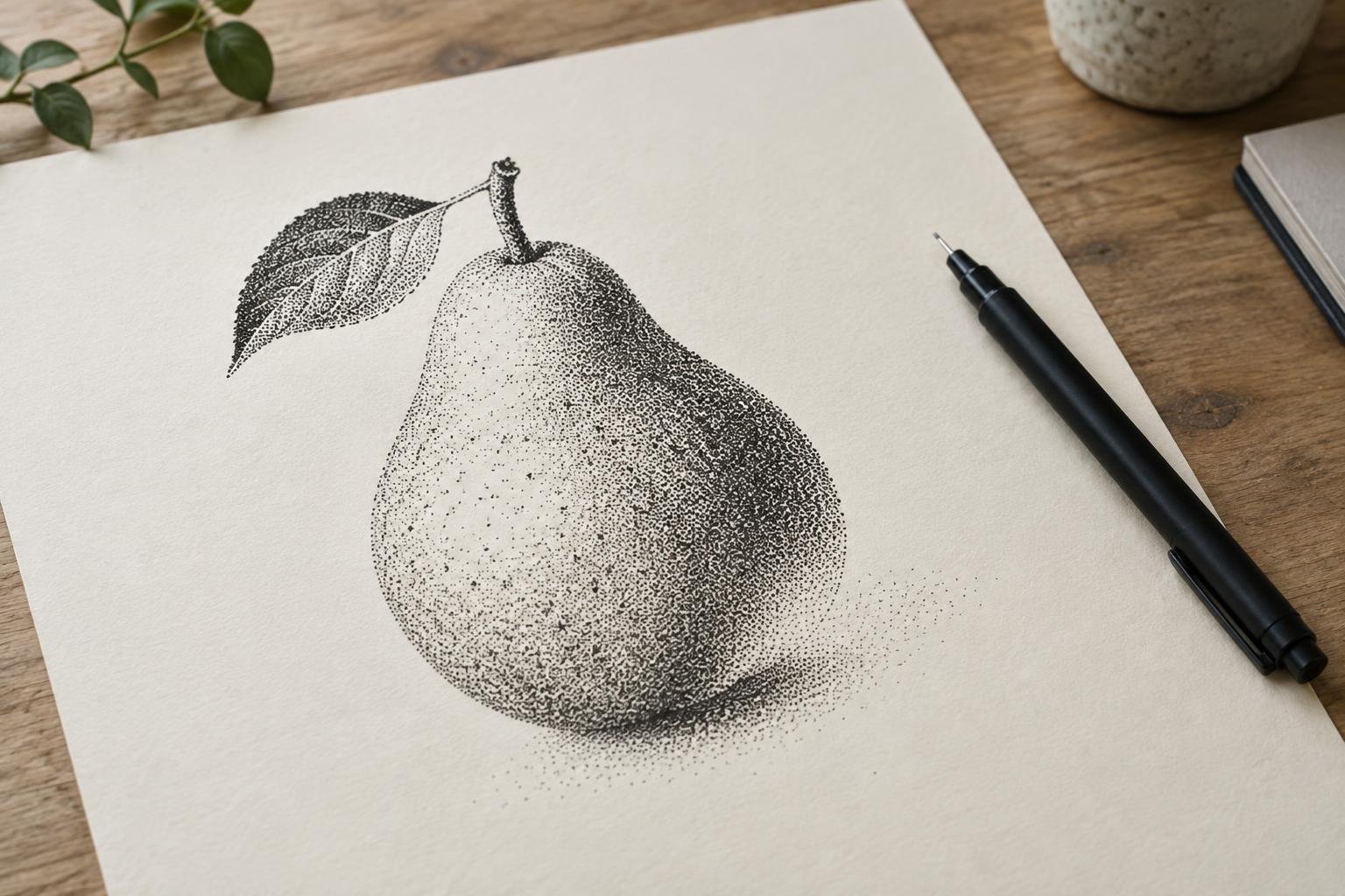
How dots become tone
Stippling is a drawing technique that uses individual dots to suggest shape, shadow and texture. A patch with widely spaced dots appears lighter than one with many dots close together. Seen from a comfortable viewing distance, those separate marks begin to read as a continuous tone. Up close, they remain visible, giving the drawing its distinctive surface.
The simplest way to control tone is to change the distance between dots. Keep them sparse in the lightest areas, then place them gradually closer as a form turns away from the light. In the darkest areas, small gaps between dots may nearly disappear. Dot size matters too, but changing both size and spacing at once can make a passage harder to control. Beginners may find it easier to work with dots of roughly consistent size.
Choose tools that make clear marks
A fine-tip ink pen is a straightforward starting tool. Choose one that makes a dot when touched briefly to the page, without needing a hard press. A dip pen can produce lively variation, but it calls for more attention to ink flow. Either can work; predictable marks are more useful than an elaborate set of supplies when you are learning.
Try your pen on the paper you intend to use. Smooth paper usually helps dots stay crisp, while a rougher surface can break up their edges. Very absorbent paper may let ink spread, bringing nearby dots together sooner than expected. Put a spare sheet under your drawing hand to reduce smudges, and allow dense passages to dry before resting your hand on them. A pencil sketch can provide a guide, though heavy pencil lines may be difficult to erase beneath ink.
Plan the light before filling the page
Before adding dots, decide where the light is coming from and which areas should remain nearly white. A simple object, such as a cup or a piece of fruit, makes a useful first subject because its broad light and shadow shapes are easy to identify. Sketch the main outline lightly, then mark only the most important boundaries between light, middle tone and deep shadow. The pencil marks are a map, not areas you must fill exactly.
Make a small value strip on scrap paper: leave the first section blank, then build several sections with progressively denser dots. This gives you a reference for how your particular pen and paper look together. Begin the drawing with the lightest shadow dots. Add darker values in passes rather than trying to finish one small patch at a time. Working across the whole subject helps you notice when one area grows too dark for the rest of the image.
Build smooth transitions and useful texture
For a gradual transition, place dots irregularly rather than arranging them in rigid rows. Look for empty spaces between existing marks and add new dots there. This helps the tone grow evenly without creating accidental stripes. Keep the pen close to upright and use light, brief touches; pressing harder can make larger marks or tire your hand. Take breaks when your dots begin to drift or your grip becomes tense.
Dots can describe a surface as well as its value. On a rounded object, let density increase gently toward the shadow while preserving a quieter area where light strikes. On a textured surface, clusters of dots can suggest small pits or uneven patches. Use this variation selectively: if every area has equally busy texture, the main form becomes harder to see. Occasionally step back from the page to check whether the light and dark shapes still read clearly.
Refine without overworking
Ink is difficult to remove, so pause before deepening a shadow. Compare it with the brightest area and the darkest area you want in the finished drawing. If a passage looks too abrupt, add a few dots along its lighter edge to soften the transition. If it looks flat, preserve more open paper beside the shadow instead of darkening everything. A clean highlight often does more for a sense of form than another layer of ink.
Some dots will be larger or closer together than intended. Rather than trying to correct each one, judge the drawing from the distance at which it will be viewed. A small irregularity may blend into the overall tone. For practice, repeat the same simple subject twice: first with a limited range of light and dark, then with a fuller set of middle tones. Comparing the two can show how much detail your image actually needs.


