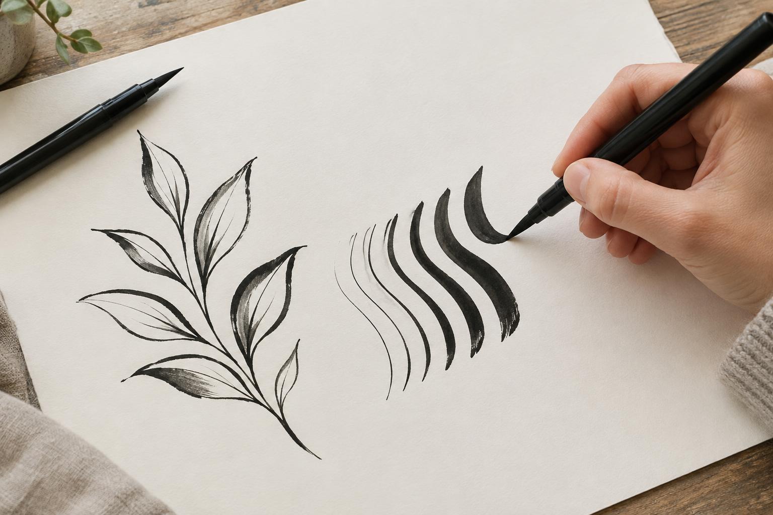
What pressure changes on the page
A brush pen has a flexible tip that bends as it meets the paper. With a light touch, only a small part of the tip makes contact, leaving a narrow line. As you add pressure, more of the tip touches the surface and the line widens. Easing off lets the tip return toward its original shape. This shift can give a single stroke a sense of movement that a uniformly thick line may not have.
Line weight can also help a viewer read an image. A heavier edge may draw attention to a foreground shape, while lighter lines can suggest texture or smaller details. In lettering, alternating thick and thin strokes gives characters a rhythm. The goal is not to press as hard as possible; it is to find a useful range of marks that your pen can make comfortably.
Set up for a steady stroke
Try a smooth sheet of paper and place another sheet beneath it if your table has a noticeable texture. A rough surface can interrupt a fine stroke and may wear a soft tip more quickly. Test the pen on a spare area first: brush pens differ in flexibility, so a pressure level that produces a broad mark with one pen may barely change another.
Hold the pen at an angle that allows the side of the tip to meet the paper when you press. An almost upright pen may make it harder to widen a stroke, while an extremely low angle can feel awkward to control. Rest your hand lightly and let your arm move with longer lines. If you find yourself gripping tightly, pause and loosen your fingers; a relaxed grip makes small pressure changes easier to notice.
Practice changing weight deliberately
Begin with a row of short, light lines. Move slowly enough to see the tip touch the page, aiming for a similar width each time. Next, make a row of broad lines by increasing pressure gradually rather than pushing down suddenly. Compare the two rows. Their widths do not need to be identical, but the difference should be clear.
For a transition drill, draw a series of long strokes that begin thin, grow thick in the middle and return to thin at the end. Think of pressure as a gradual rise and fall. Then try the same motion along a gentle curve. If the stroke ends in a blunt mark, start releasing pressure earlier, before the pen stops moving.
In lettering practice, light upward strokes and heavier downward strokes are a useful starting pattern because the upward motion is often easier with less pressure. Draw simple loops or repeated U shapes and pay attention to the turn at the bottom: release pressure as you curve upward. Treat this as an exercise in control, not a rule that every letter or drawing must follow.
Use line weight to describe a subject
Once the motion feels familiar, draw an everyday object such as a mug or a leaf. Sketch its outline lightly with the brush pen, then add weight only where it serves the drawing. You might make the underside of a mug darker to suggest its place on a surface, or use a broad stroke along one edge of a leaf and finer lines for its veins. Leave some edges light so the bold marks have room to stand out.
Try completing the same small drawing twice. In the first version, keep every line close to the same width. In the second, vary pressure to emphasize a few edges. Looking at the pair can show you whether the heavier marks clarify the form or compete for attention. A small number of purposeful changes often reads more clearly than making every line dramatic.
Work through common difficulties
If thin lines look shaky, slow down a little and use a comfortable stroke length. You can also practice moving your hand across the paper without making a mark, then repeat the motion with the tip touching lightly. If thick strokes look uneven, check whether your pressure changes abruptly or your pen angle shifts as you move. Short, repeated drills can help you isolate one adjustment at a time.
A frayed tip can make fine lines harder to produce, while very absorbent paper may soften the edges of a stroke. When marks behave unexpectedly, test another sheet or pen before assuming your hand is the problem. Keep a page of experiments rather than discarding it: rows of thin, thick and transitioning strokes make a useful record of what each tool does. With practice, pressure becomes a choice you can use to guide the eye, not simply an effect that happens by accident.


