Start with the color name, then look beyond it
The name on the front of a paint tube is a useful starting point, but it may not tell you exactly what is inside. Names such as “sky blue” describe an appearance; they do not identify a particular pigment. Even familiar color names can refer to different mixtures across brands or paint ranges. If you want to replace a color later, compare labels rather than relying on the name alone.
First, check the medium and product range. Watercolor, acrylic, and oil paint can behave differently even when they share a pigment. A student range and an artist range may also use different formulations. Then look for the pigment listing, an opacity mark, and a lightfastness rating. Those three details help answer distinct questions: what gives the paint its color, how much it covers, and how well that color is expected to resist fading.
Decode pigment names and codes
Many labels identify colorants with pigment codes. A code beginning with P indicates a pigment; the following letters indicate a broad color family, and the number identifies a particular pigment within that family. For example, PB refers to a blue pigment and PR to a red pigment. PW6 identifies titanium white, a common white pigment. Codes are particularly helpful when two brands use different names for similar colors—or the same name for paints made with different pigments.
A label may list one pigment or several. Single-pigment paints can be useful when you want to learn how one color mixes, while mixtures may offer a convenient ready-made shade. Neither is automatically better. If a color name includes “hue,” it often indicates a substitute for a traditionally named pigment; the pigment list tells you more about what that substitute contains.
Pigment codes are not a complete recipe. They do not reveal every ingredient, the proportion of each pigment, or exactly how a paint will handle. If the code is difficult to find on a small tube, check the packaging or the maker’s product information. When comparing colors, note the pigment code alongside the brand, medium, and range.
Understand opacity without expecting a guarantee
Opacity describes how much a layer of paint hides what is underneath. Labels may say transparent, semi-transparent, semi-opaque, or opaque. Some brands use an empty, partly filled, or solid square or circle instead. Because symbols are not always identical across manufacturers, use the key provided for that paint range when one is available.
Transparency matters in practical ways. A transparent watercolor may let the white of the paper or an earlier wash show through. An opaque paint can help cover a previous layer or create a flatter-looking area of color. Neither quality is inherently preferable: the useful choice depends on whether you want layers to remain visible or to be concealed.
Treat the label as a guide, not a promise about every brushstroke. Dilution, layer thickness, surface color, and application all affect how much coverage you see. Try a small stroke over a dark line and let it dry if coverage is important to your project. Opacity is also different from staining, which describes how strongly a paint colors a surface and how readily it lifts.
Compare lightfastness ratings carefully
Lightfastness is a paint’s resistance to color change caused by exposure to light. It matters most when a finished work will be displayed rather than kept closed in a sketchbook. A label might show a word rating, a star scale, a Roman numeral, or another symbol. Read the maker’s key before comparing ratings: a larger number means better resistance on some scales, but not on all of them.
Some labels refer to a named testing standard, while others use the manufacturer’s own system. That distinction matters when comparing brands. A lightfastness rating also applies to the particular paint product being rated, not necessarily every paint carrying the same pigment code. If long-term display matters to you, favor a clearly explained, high lightfastness rating and keep a record of the colors you used.
Lightfastness is not a guarantee that a painting will remain unchanged. Display conditions and other materials can affect its appearance over time. Nor does a high lightfastness rating say anything about a paint’s suitability for skin contact or about safe handling; follow the product’s separate safety information.
Make a quick label-reading habit
When considering a new color, ask four questions: What medium and range is it? Which pigments are listed? Is it transparent or opaque enough for the way I plan to layer it? How is its lightfastness rated, and what does that scale mean? These checks are especially useful when replacing a favorite color or choosing paints for a piece you intend to display.
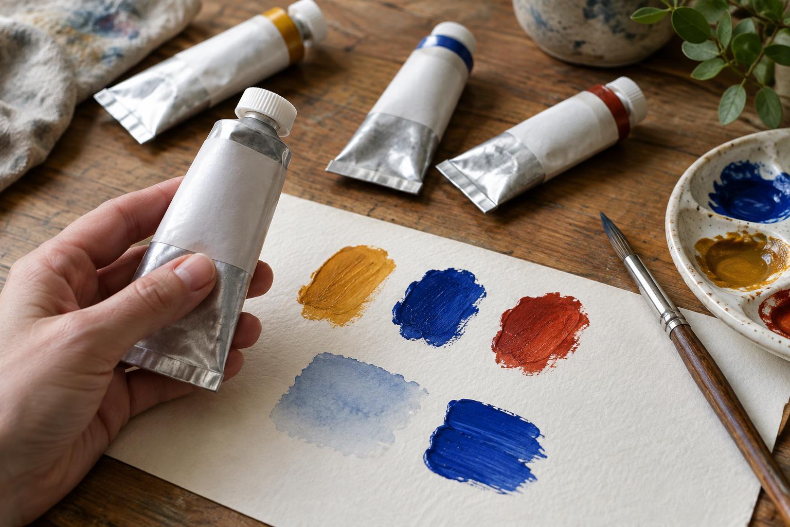
Finally, make a small swatch on the surface you normally use. Add a thin stroke, a thicker stroke, and a pass over a dark mark. The label helps you narrow your choices; the swatch shows how that particular paint works in your hands. Together, they make shopping and color mixing less of a guessing game.


