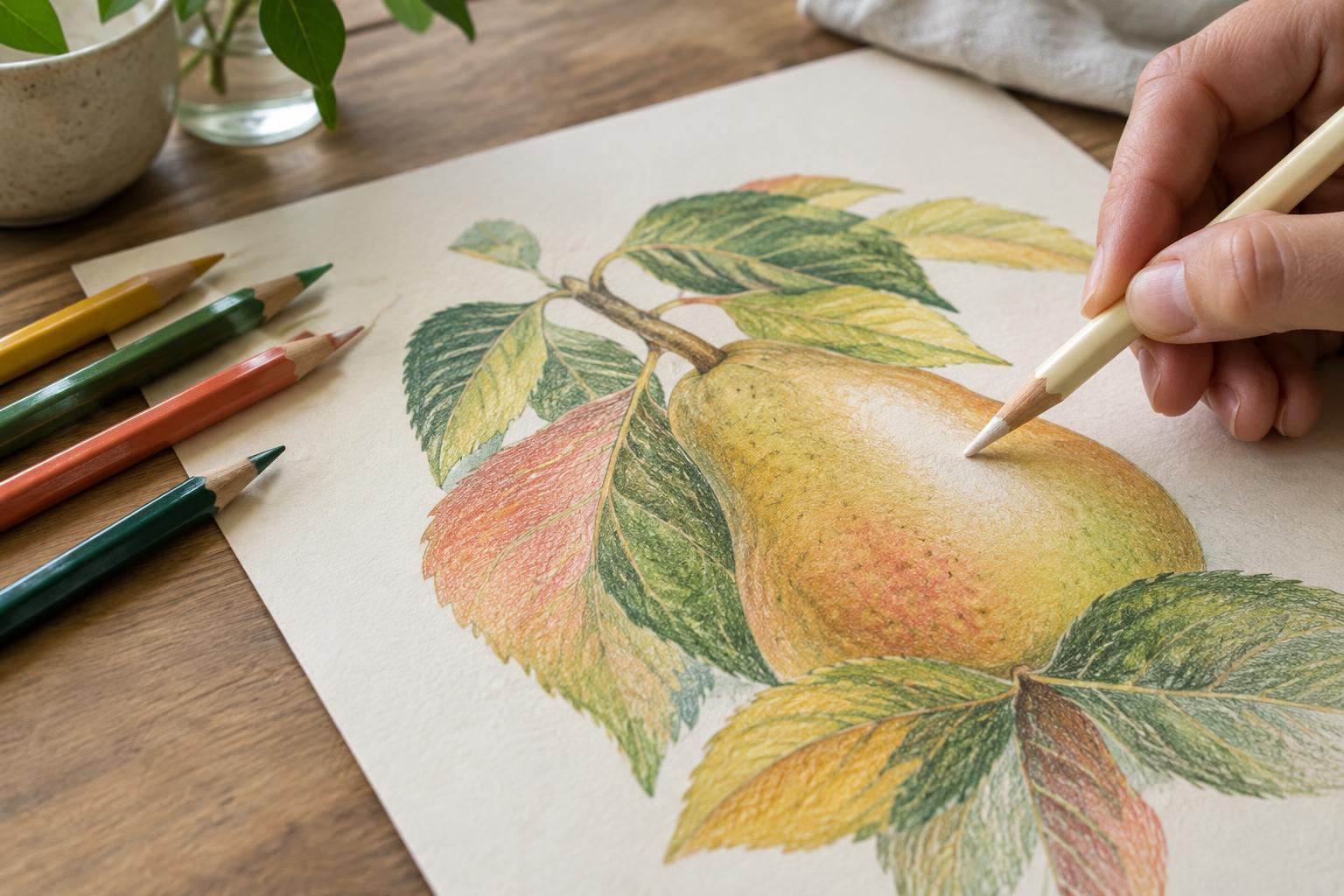
Start with the paper and a color plan
Colored pencil builds gradually. Each stroke leaves pigment on the surface and in the tiny dips of the paper, often called its tooth. As layers accumulate, less tooth remains to hold new color. That makes your early choices important: if you fill the surface with heavy pressure before deciding on your colors, it becomes harder to adjust them later.
Before starting a finished drawing, try your intended colors on a scrap of the same paper. Make a small strip with one color on its own, then test what happens when you layer the others over it. This is especially useful for shadows. A dark brown or blue may give a red object the depth you want, while repeated layers of several unrelated dark colors may make it look dull. Keep the test strip nearby as a simple guide.
Build color with light, deliberate layers
Begin with a light touch and leave some paper texture visible. Use small circular strokes for an even area, or follow the form of the object with strokes that help describe its shape. Add color gradually, moving between your main hue, a lighter version for bright areas, and a darker or cooler color for shadows. Light pressure gives you room to change direction before the surface becomes crowded.
Think about value as well as hue. If every area receives the same amount of pencil, a drawing can look flat even when its colors are vivid. Reserve the lightest areas rather than covering them and trying to recover them with white pencil. Build darker areas in stages, checking the drawing from a short distance to see whether the lights and shadows still read clearly.
Keep mixtures clear instead of muddy
Muddiness often comes from adding colors without a clear purpose. Complementary colors, such as red and green, can make useful muted shadows, but layering both heavily may produce a neutral result where you wanted brightness. Decide whether a passage should stay vivid or become subdued. For a bright orange, for example, you might layer yellow and orange, then introduce a small amount of red for depth rather than reaching immediately for a dark contrasting color.
It also helps to separate color mixing from correction. If a passage looks too dark, piling on a pale pencil will not necessarily restore its original brightness; it may simply make the area more opaque. Pause and compare the passage with your test strip. Sometimes the better choice is to deepen the surrounding shadows so the area appears lighter by contrast, or to leave a subtle imperfection rather than overwork the paper.
Burnish when the layers are nearly finished
Burnishing means pressing firmly with a pencil to blend existing layers and push pigment into the paper’s texture. It can create a smooth, saturated finish, but it also compresses the tooth. Treat it as a late step, after you are satisfied with the main colors and values. Burnish a small area first to see how your particular pencils and paper respond.
The pencil you use affects the result. A light-colored pencil can soften and lighten a mixture; a pencil close to the area’s main hue may preserve more of its color. A colorless blender can smooth layers without deliberately adding another hue, though the finish will still depend on the materials underneath. Use controlled pressure rather than forcing the point into the paper, and avoid burnishing highlights, fine textures, or details you still need to develop.
Choose where to leave texture
Not every part of a colored pencil drawing needs a polished surface. Smoothly burnished areas can sit beside visible strokes and small flecks of paper, giving the image contrast and character. A glossy ceramic cup, for instance, might benefit from smooth transitions, while the fabric behind it may look more convincing with a softer, grainier finish.
If an area stops accepting color, resist the urge to keep pressing harder. Work around it, sharpen edges that still have room for pigment, or let the existing texture become part of the drawing. Layering works best when each pass has a job: establishing a base, adjusting a hue, deepening a value, or bringing an area to its final finish. That simple pause between layers can do more for clear color than another pencil stroke.


