What artists mean by paper texture
Run a fingertip lightly across two sheets of drawing paper and you may feel a clear difference. One can seem almost slick; another feels gently rough or visibly grainy. That surface quality is often called tooth. A paper with more tooth has tiny peaks and hollows that catch drawing material. A smoother sheet offers fewer interruptions between the tool and the page.
Texture is only one part of a paper’s behavior. Fibers, surface treatment and thickness also affect how a sheet responds, especially to liquid ink. Two papers that look equally smooth may handle the same pen differently. Rather than treating labels such as smooth or textured as guarantees, use them as a starting point for choosing a surface that suits the marks you want to make.
How texture changes pencil marks
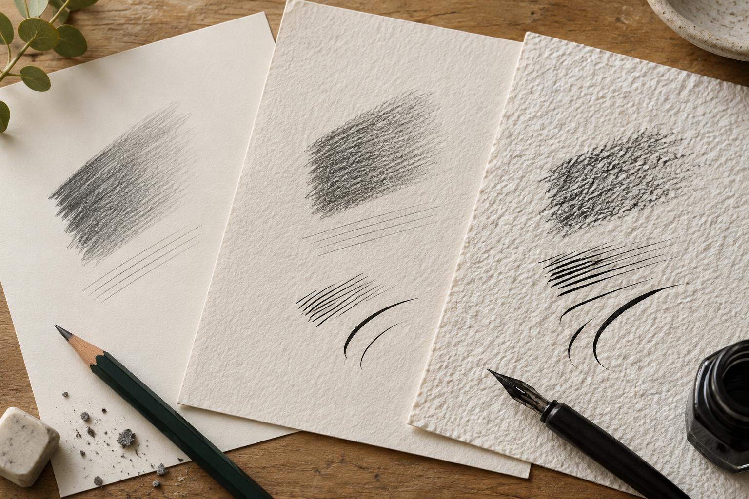
On textured paper, a pencil first touches the raised parts of the surface. A light stroke may leave small gaps where the graphite has not reached the hollows. This broken mark can give shadows, fabric or landscape sketches a lively, granular quality. With repeated passes, the gaps gradually fill and the tone becomes denser. Softer pencils generally deposit graphite more readily, while harder pencils can make lighter, finer marks.
Smooth paper makes it easier to draw crisp outlines, small details and even tonal transitions. It can be useful for careful studies or drawings that depend on clean edges. Yet a very smooth surface may offer less grip for building many layers of graphite. Pressing harder is not always the answer: it can indent the sheet or produce shiny, difficult-to-adjust patches. Try varying pencil softness and layering lightly before increasing pressure.
Texture also affects corrections. Erasing can lift graphite from raised areas while leaving some pigment or graphite in deeper hollows. That remnant may be welcome in a loose sketch but frustrating in a drawing that needs a clean white highlight. Test your eraser on a spare corner of the paper, using a light touch rather than scrubbing the surface.
How texture changes ink lines
A pen needs steady contact with the page to make a continuous line. On rougher paper, a fine nib may catch or skip over the surface, especially when drawn quickly. That interruption can be expressive in a sketch, but it may work against precise lettering or intricate contours. Broader, more flexible marks can sometimes accommodate texture better, although the result depends on the pen and ink as well as the sheet.
Paper texture does not by itself tell you whether ink will spread. A sheet’s absorbency and surface treatment matter too. On a more absorbent paper, a line may look soft at the edges or spread along the fibers. On a less absorbent surface, the line may stay sharp but take longer to dry, increasing the chance of a smudge. If you plan to add an ink wash, also check whether the sheet wrinkles, pills or allows color to show through the back.
These differences are especially noticeable when combining ink and pencil. A fine ink outline on a grainy sheet might have small gaps beside a textured pencil shadow; on a smooth sheet, both materials may look more controlled. Neither effect is inherently better. The useful question is whether the paper helps the marks support each other.
Choosing a surface for the drawing you want
Start with the most demanding part of your drawing. For delicate pen lines, detailed pencil work or frequent erasing, consider a relatively smooth drawing surface and check that it handles your ink. For layered pencil shading or marks that benefit from visible grain, try a sheet with moderate tooth. If you want to use wet ink generously, choose paper intended to tolerate wet media rather than relying on thickness alone.
Paper weight can influence how sturdy a sheet feels, but a heavier sheet is not automatically better for every tool. A light paper with a suitable surface may give cleaner pen lines than a heavier, highly absorbent one. Likewise, a textured sheet can be excellent for pencil yet awkward for a scratchy nib. If a drawing will be handled often or kept for a long time, consider how the paper is described for durability, while remembering that storage and handling also matter.
Make a small test before committing
A simple test strip can save time and help you notice differences that are easy to miss in a shop. On a spare piece of the same paper, draw a slow line and a quick line with your usual pen. Add a small ink-filled area, then let it dry before checking the edges, reverse side and any smudging. Next, make a light pencil gradient, build a darker patch in layers and erase one section.
Look at the marks from arm’s length as well as up close. Does the grain add character or distract from the subject? Are the ink lines as sharp or loose as you want? Does the paper stay comfortable to work on after several passes? Keep a few labeled samples with your materials. Over time, they become a practical guide to choosing paper by the marks it makes possible, not just by how its surface feels.


