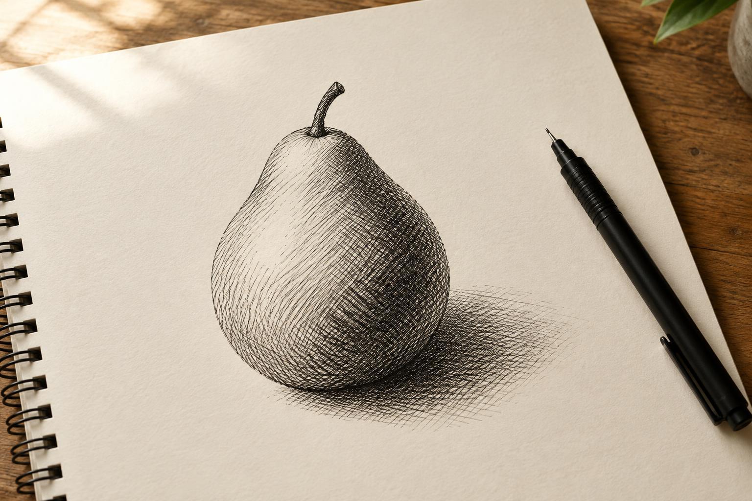
How lines become tone
Hatching is a way of shading with a series of lines. Crosshatching adds another set of lines across the first, creating a denser pattern. From nearby, you can see the individual marks; from farther away, they begin to read as areas of light and dark. Both techniques work with a pencil, pen or other tool that makes a controlled line.
The simplest way to change the tone is to change the space between marks. Lines set far apart leave more of the paper visible and look lighter. Lines placed close together look darker. You can also add layers, use a broader line or press more firmly with a pencil. Each choice changes the character of the drawing as well as its darkness, so it helps to begin with spacing before trying to adjust everything at once.
Start with a small value scale
Before drawing an object, divide a strip of paper into five boxes. Leave the first box blank for your lightest value. In the second, draw evenly spaced parallel lines. Move the lines closer together in the third. For the fourth, add a second layer at an angle. In the fifth, add another layer or tighten the spacing until you have a dark value you can still distinguish from the fourth. This exercise gives you a range of tones to use in a larger drawing.
Try to keep the marks steady, but do not worry about making them mechanically identical. Uneven lines can be lively. What matters for a clear value scale is that each box looks darker than the one before it when you step back. If two boxes look alike, adjust one by changing its spacing or adding a few marks rather than filling it in indiscriminately.
Choose directions that describe form
Line direction can help explain the shape of what you are drawing. Straight, parallel strokes may suit a flat wall or a cast shadow. Gently curved strokes can follow the surface of an apple, cup or folded sleeve. These form-following marks are sometimes called contour hatching. They give the viewer clues about how a surface turns, even before you add a second layer.
For crosshatching, the second set of lines need not meet the first at a perfect right angle. A shallow crossing angle can create a softer-looking mesh; a stronger angle makes the pattern more noticeable. On a rounded object, let both sets respond to the form instead of laying a rigid grid over it. Keep an eye on the overall light and dark areas, though: attractive marks are less useful if they obscure the shape you want to show.
Build shadows gradually
Choose a simple object and imagine light arriving from one side. Identify the brightest area, the darker side and the shadow the object casts. Leave the brightest area mostly untouched. Add a light layer of hatching where the form begins to turn away from the light, then bring the lines closer or cross them where you need a deeper shadow. Look at the drawing from a short distance between layers; this makes it easier to judge tone rather than individual strokes.
A cast shadow often has a different shape from the shading on the object. Its lines can follow the ground plane instead of the object's curved surface, helping the two areas remain distinct. You do not need to hatch every patch of paper. Clear untouched areas provide contrast, while a few carefully placed darks can make the lighter tones easier to read.
Adapt the technique to your tool
Pencil is forgiving: you can vary pressure and lighten marks with an eraser. With ink, it is often easier to start lighter than you think necessary, because dark marks cannot be removed as easily. A fine pen allows closely spaced lines, while a broader tip produces bold patterns with fewer strokes. Whatever you choose, test it on the paper first. Rough paper may interrupt a fine line; smooth paper may make quick strokes feel slippery.
If a drawing becomes muddy, pause before adding more lines. The problem may be that the midtones and shadows are too similar, or that lines change direction without describing a form. Compare your drawing with your value scale, simplify one area and preserve a few light spaces. Hatching rewards patience, but it does not require perfection: the goal is to make deliberate marks that work together when you view the drawing as a whole.


