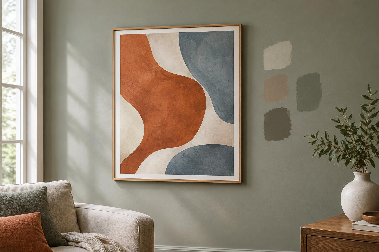
Start with the artwork, not a favorite paint color
A wall does not need to disappear to be a good backdrop. It needs to help you see the artwork clearly while making the room feel comfortable. Before browsing paint colors, look at the pieces you plan to hang. Notice their dominant colors, but also their quieter details: a pale line in a drawing, a warm background in a print or a dark edge around a photograph. Think about whether you want the whole piece to feel calm within the room or to catch your eye as soon as you enter.
If you have several works, look for what they share rather than trying to match every color. A collection of varied prints might be united by dark frames, plenty of white space or a similar mood. Those common features can guide your wall choice more reliably than any single accent color.
Use contrast to make the edges clear
Contrast is often the simplest way to help art stand out. A light artwork can gain definition against a medium-toned wall, while a dark piece may look especially clear on a pale one. The goal is not always the strongest possible contrast. A gentle difference can suit a quiet watercolor or a group of delicate drawings; a bolder difference can give a graphic poster or vivid painting more presence.
Pay attention to the frame and any mat as well as the image. A print with a wide white mat already has a visual border, so it may hold its own on a darker wall. A frameless canvas relies more directly on the wall behind it. If an artwork seems to blend into a proposed color, compare the tones at its outer edges. Changing the wall color slightly lighter, darker or less saturated may be enough to restore definition.
A colorful wall can work, too, particularly when the artwork has a strong shape or a restrained palette. If both wall and artwork are visually busy, however, they may compete. In that case, a quieter wall color often gives the viewer more room to enjoy the details.
Look for undertones, not exact matches
Two colors can appear similar on a paint card but feel quite different beside an artwork. A white may lean creamy or cool; a gray may have hints of blue, green or brown. These undertones can make a color in the artwork feel more noticeable, or make the whole pairing feel unsettled. Rather than searching for an exact match, try choosing a wall color that relates to the artwork’s overall temperature or provides a deliberate contrast.
For example, a painting with earthy reds and soft browns might feel cohesive beside a warm off-white. A cool, blue-heavy photograph might look crisp against a muted warm neutral. These are possibilities, not rules: personal preference and the surrounding furniture matter just as much. If a proposed wall color repeats a small color from the artwork, check whether it draws attention to the piece or makes that detail harder to see.
Test the color in the room
Wall color changes with its surroundings. Daylight, lamps, nearby furnishings and even the direction you face can affect how a paint color appears. A sample that looks balanced in a shop may seem much cooler or darker at home. Place generous paint samples or movable sample boards close to the intended hanging spot, and look at them beside the artwork at several times when you normally use the room.
View the pairing from more than one distance. Up close, you might notice an undertone you dislike; from the doorway, you can see whether the art remains the focal point. If possible, hold the sample behind an edge of the framed work rather than relying on memory. A movable board is useful when you do not want to paint a test patch directly on the wall.
Let the room share the decision
The best backdrop for one painting may not be the best color for an entire room. Consider how much wall will remain visible around the art, and whether the space is used for reading, working or relaxing. A saturated accent wall can give a single piece a defined setting, while a soft neutral may make it easier to rearrange a changing collection. Neither approach is more artistic; each creates a different experience of the room.
You can also make smaller changes before repainting. Try moving a piece to a wall with better contrast, adjusting its position away from a crowded shelf or changing a mat or frame. If painting is an option, choose the color after seeing samples alongside the work, not just on a screen. The most useful test is straightforward: when you enter the room, do you notice the artwork, and do you still enjoy looking at it there?


