What a glaze does
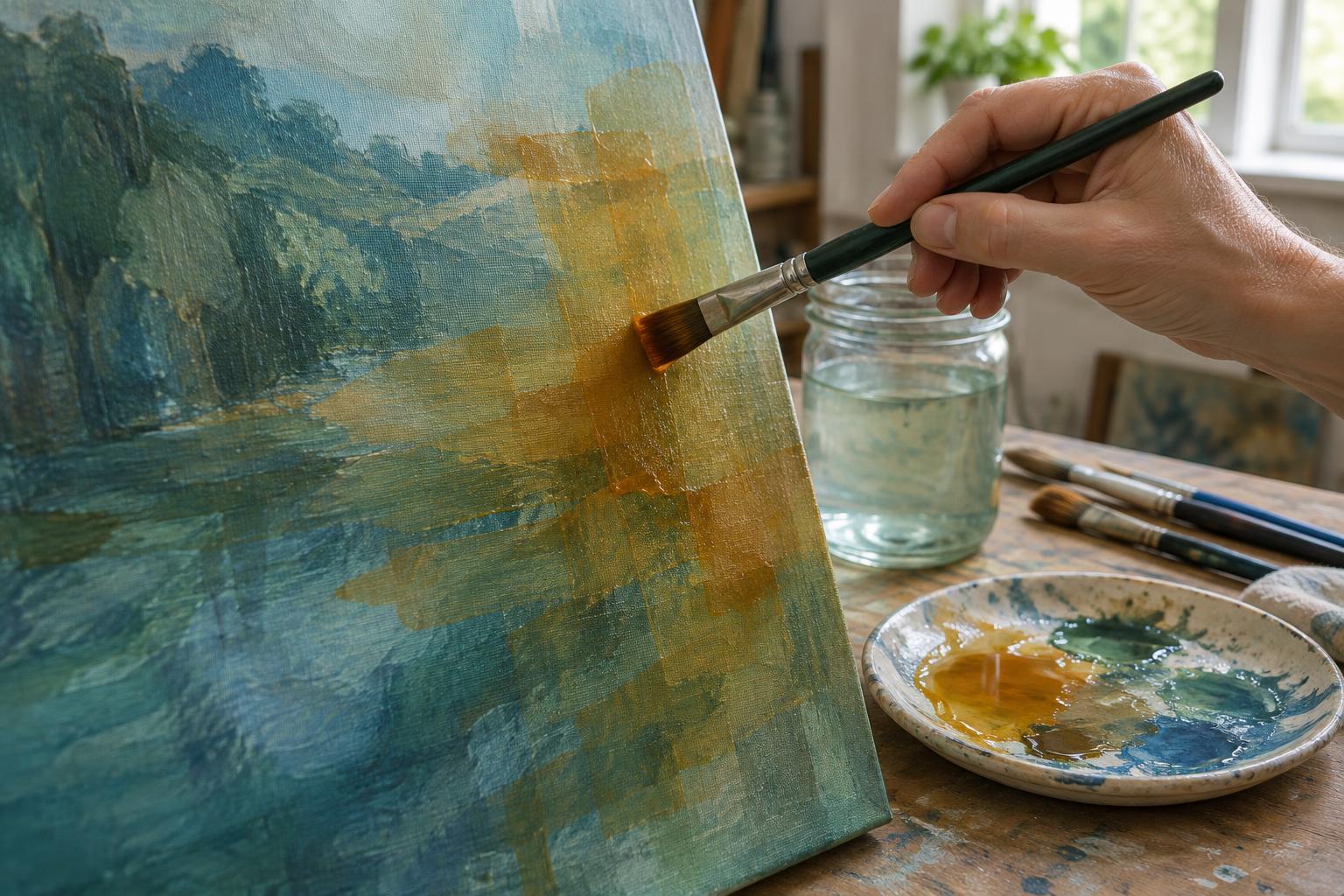
An acrylic glaze is a thin layer of color that allows some of the painting beneath it to remain visible. Instead of mixing every final color on the palette, you can place one color over another and let them work together on the surface. A warm glaze over a cool passage may change its mood without hiding its shapes. A darker glaze can bring an area forward as a shadow while preserving details already painted.
Glazing is especially useful when a color feels almost right. It lets you adjust a passage gradually rather than repaint it from scratch. It can also connect separate parts of a composition: a restrained glaze repeated across several areas may make their colors feel more related. The effect depends on the colors you use, how transparent they are, and what lies underneath.
Choose materials that support transparency
Start with acrylic paint, a clean soft brush, a palette, and a dry painted surface. A glazing medium can help spread a small amount of paint into a transparent film while retaining enough binder to hold the pigment in place. Check the product label for its intended use and mixing guidance. Gloss medium tends to keep colors clear; matte medium can soften the sheen but may make a glaze look slightly less transparent.
Paint colors differ in opacity, even within the same range. If you want the underpainting to show through clearly, choose a more transparent color or use less of an opaque one. Test a stroke over a dark-and-light scrap before applying it to your painting. Adding a little water can improve flow, but using water alone to make a very weak wash may leave pigment unevenly distributed or less securely bound. For a highly diluted layer, a suitable medium is the more dependable starting point.
Build color one dry layer at a time
Begin with an underpainting whose main shapes and values already work. Glazing changes color more readily than it corrects a confusing arrangement of lights and darks. Let the base dry fully, then mix a small amount of paint into medium until a brushstroke leaves the surface beneath visible. Try the mixture on a scrap painted in similar colors; a glaze can look different over white, dark blue, or a warm brown.
Apply a thin, even coat with a soft brush, working across the area without repeatedly scrubbing it. Acrylics can become tacky as they dry, so leave a glaze alone once it begins to set. Wait until it is completely dry before deciding whether to add another layer. A damp-looking glaze may appear stronger or glossier than it will when dry, and brushing into it too soon can lift or disturb the surface.
Build toward the effect in several restrained passes. For example, a pale yellow glaze over a dry blue-green area can nudge it toward a livelier green. A transparent warm color over a cool gray can suggest reflected light. Keep a little of the original surface unglazed if you want a clear comparison as you work.
Use layers to guide the eye
Glazes do not have to cover the whole painting. You can use one to deepen a shadow, warm a face of an object, or quiet a background that competes with the focal point. A broad, subtle glaze can unify an area, while a smaller glaze can lead the viewer’s attention to a particular shape. Consider where you want contrast before adding more color: every layer changes the relationship between the glazed area and its neighbors.
Color choices matter as much as transparency. Layering colors that pull in different directions can produce a subdued result, which may be useful for shadows or atmospheric distance. If you want a bright passage, start with a suitably light base and test the next color before committing. A transparent glaze generally cannot make a dark passage as bright as a fresh light-colored layer can.
Troubleshoot without losing the surface
If a glaze dries streaky, the mixture may be too thick, the brush may be too stiff, or the paint may have been worked for too long. Test a thinner application with a softer brush on a scrap. If a layer looks muddy, pause before adding more: let it dry, compare it with the surrounding colors, and decide whether a fresh opaque or semi-opaque passage would serve the painting better.
For a first exercise, paint a simple row of shapes in two base colors. Once dry, brush the same glaze over half of each shape and leave the other half untouched. Repeat on one shape after the first glaze dries. This small comparison shows how the base color and the number of layers affect the result. The aim is not to follow a fixed number of coats, but to stop when the color supports the image you want to make.


